by Jake Johnson and Stephanie Haworth
If you’ve been around these parts before, you probably notice that things look a little different now. Both our brand system and website are completely overhauled.
There are a number of reasons that go into the decision to embark on such projects. Many are internal and not really of interest to most folks (except us creatives who like to wax poetic about them). But the most compelling reason is that customer experience matters.
Based on two years of research, we know that small businesses experience a lot of chaos. From working in multiple systems to keeping tabs on multiple customers and communication streams, to switching between to-dos and wearing a lot of hats, each day presents many challenges. The last thing they need is more chaos. Infusionsoft exists to help bring order to the chaos, where we can. And we decided six months ago to reflect that better both in our product and service experiences, as well as our brand and website.
I don’t feel it’s beneficial to go into all the sausage making on how we evolved the brand and website, but suffice to say, it was a months-long project involving testing with small business owners at the heart of all we did.
New colors
Perhaps the most dramatic change to our design system is a new, more vibrant color palette with a lot of white space to breathe.
Our previous colors were a bit muddy and drab, employing darker shades and grays that felt heavy and didn’t lend themselves well to a primarily digital brand.
As such we had a number of user experience issues. For instance, we didn’t have colors with high contrast, which made it hard for visitors to see and interact with buttons and links. People often missed them or had to search longer than they should.
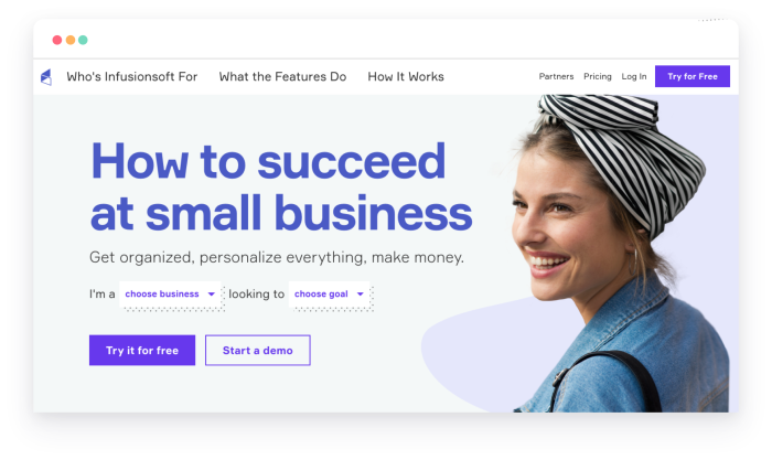
Our new color palette features an electric purple that is used only for action items like buttons and other interactive elements. They are now clearly visible and consistent across the entire system, so when visitors see a purple element they know it’s something to explore.
Additionally, we wanted our brand to reflect the vibrant energy of our customers, which is something our old system didn’t do. Lots of bright colors employed sparingly are designed to create bursts of energy and evoke happiness in users. And who doesn’t like to be happy?
New font
We’ve also changed out our font to Formular, which is a Swiss typeface that’s readable and precise but also full of personality.
Perhaps what you’ll notice most is how large it is. We did it on purpose. We had gotten quite verbose, and long blocks of copy in small sizes made people work to figure out who we were and how we could help them.
Everyone is busy and no one wants to spend unnecessary time hunting for information. So we joined the big type revolution as a gift to customers and a challenge to ourselves to say more with less.
Mark Twain is famous for writing, “I didn’t have time to write you a short letter, so I wrote a long one instead.” We’re taking the time to write short copy, and the extra work is worth it because it respects people’s time.
New logo
Updating our colors and typeface also allowed us to take a fresh look at our logo. The old one was two-tone (green and gray) both in the cornerstone and in the wordmark itself. It also had a custom typeface treatment that was, let’s just be honest here, pretty dated. It looked like something from the past trying to look futuristic, which it was.
![]()
In short, it was complicated where everything else was becoming simpler. We retained our cornerstone logo mark but stripped it back to a more scalable and simple silhouette. We also replaced the font with Formular, making it consistent with the typography across the site and the design system. Finally, we focused on visually balancing the wordmark by darkening the second half of the name Infusionsoft, which also improved on our logo’s long-running contrast issue.
The result is a logo that retains the heart of our old one but with a fresh face that is more versatile.
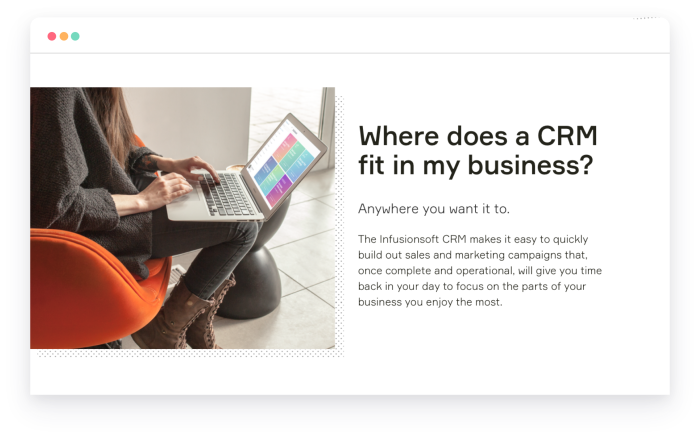
Photo styles
Our old design system used a lot of stock photography. Easy? Yes. Helpful? Not really.
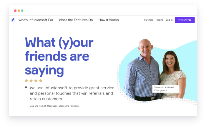
A driving principle behind our rebrand was to bring our favorite people to the forefront of the website—our customers. So we developed a system that utilized cut-outs of our customers, eliminating the distractions of background noise and have placed photos of actual people with actual stories wherever we can.
You’ll notice they’re also usually overlaid on colorful, amorphous blobs. They act as frames, and we affectionately call them “flubbers.”

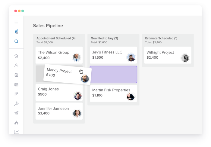
We also revamped the way we do our screenshots for the product. We have a wonderful new user interface on the product side to show off, so we’re taking advantage of that. But we also wanted to be clearer on the benefit of any given feature so people could understand immediately how it could help them and their business. We took a machete to unnecessary UI elements and employed tiles to focus on specific functionality or benefits. Coupled with stripped down and thoughtful visuals, we created an image caption design element to make sure we give a little guiding copy to take things across the finish line for folks.
Streamlined navigation
On the new website, you’ll notice immediately that our navigation is simplified. The old site had seven top-level pages to choose from with seemingly endless subpages, as well as a “More” link that opened a slider with even more options! It was all a bit inside out and focused on offering up all the things instead of the right things. People didn’t know where to start or simply felt overwhelmed.
The new site’s navigation has three main sections: Who is Infusionsoft for, What the features do, and How it works. There’s also a utility navigation to the right for pricing, customer login, and free trial access.
After testing with small business owners, we structured our underlying sitemap and visible navigations based on what they were looking for. The goal was to create a “shallow site” that bubbled up the most important topics and then allowed visitors to dig deeper into subjects of interest while making it very clear how to find yourself in the site structure. The hope is this helps visitors find what they’re seeking faster and surprises them with useful content they didn’t know they wanted.
Handing over controls
The old website was heavily gated. If you wanted to talk to sales, you had to fill out a form, wait for us to get in contact with you, schedule a time for a demo, and have a phone call with a sales representative. It was a process filled with a lot of friction.
We’ve worked hard to hand control over to the visitor. There are now many ways to experience the product or get answers to your questions.
Opening up a free trial experience was a big focus for us. Making it easy? Even more so. You can now immediately get into the product from anywhere on the site and begin experiencing it for yourself within a matter of minutes. If you want to talk to someone you can still do that with chat integrated into the product experience.
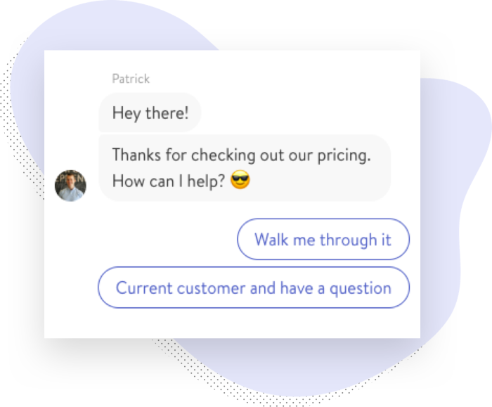
Have questions you can’t find answers to quick enough on the website? We’re now using chat throughout to get in contact with us right away. It’s initially a bot conversation but you’ll be quickly transferred to a real person on our team to help you out in minutes. No more waiting, and a lot less friction.
Truly free educational content
We have a lot of awesome educational materials like guides and webinars for small businesses. Traditionally, you’d have to fill out a form to access them, though. I mean we all know how the game is played, right? No free lunch. After all, we want to talk with you.
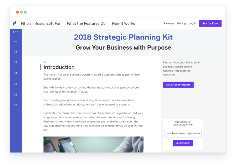
We’ve changed all that. We’re in the process of un-gating our educational content, as well as making them available as online guides rather than PDFs. We have over twenty done and more to come. Now if you want to watch a webinar or read a guide, we’re not going to get in your way. And if there are updates, you can trust that what’s online is current.
Plus, we’ve moved our sales and marketing blog into our main site, and there are thousands of helpful posts that you can read at your leisure.
More to come
This is just the beginning. Over the next many months, you’ll see continued improvements to the site and brand system, such as truly honest comparison pages showing how we stack up to the competition and the ability to add reviews of our product right on our website. All these changes are aimed at providing the best experience possible for our customers and visitors, built on our principles to simplify and hand over control.
