In order to make your business a success, it’s essential to convert your website visitors into customers.
In fact, nearly 96 percent of your first-time visitors are not ready to purchase from your website right away.
This is why list building is a crucial aspect of your business. With email marketing, you can build a relationship with your visitors over time and convert them into customers when they’re ready.
Your opt-in form is one of the most important elements that can make or break your list building campaign. To persuade more visitors to subscribe to your list, you’ll need to create an opt-in form that grabs attention and converts.
In this post, we’ll take a look at a how to design an irresistible opt-in form.
Use an eye-catching design
The attention span of your website visitors is now less than that of a goldfish—eight seconds.
When it comes to designing your form, the first goal is to grab your visitors’ attention. Once you’ve attracted the attention of your potential prospects, you can entice them to sign up to your list.
What’s the best way to attract attention to your form? Let’s take a look at a few tips below.
Use a contrasting design
Placing a form in a container with a contrasting design helps you to make your form stand out from the rest of the content on your page.
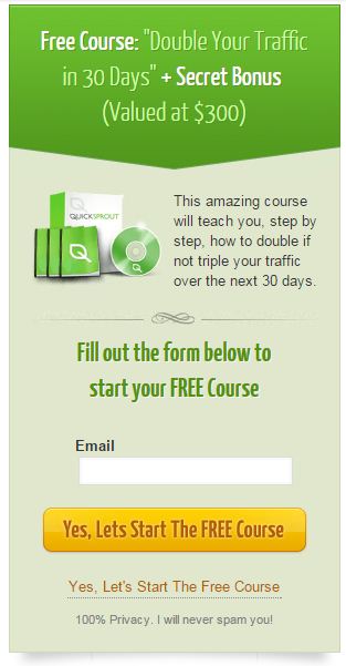
For example, take a look at an example of an encapsulated form from QuickSprout below.
Here, the form’s container uses a contrasting color that doesn’t blend into the rest of the design.
The location of the form is also an important aspect. This form is also placed at the top of the sidebar to ensure high visibility.
Use directional cues
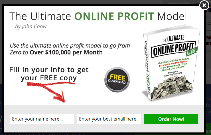
Using a directional cue in your form tells your visitors where to focus on your form.
Arrows that point to the form fields and call to action are highly effective for drawing the user’s attention to the right area.
You can see this tip in action in John Chow’s form:
Use animated effects
Adding an animation effect to your form is a highly effective way to attract the attention of your website visitors.
Animated effects can easily be added to opt-in forms in popups and slide-ins—more on those opt-in types below.
Choose the right opt-in type
While a simple opt-in form in your sidebar might net a few subscribers, they don’t tend to be very effective.
Visitors tend to ignore those static sidebar opt-ins due to banner blindness.
To maximize your subscriber growth, it’s important to test different opt-in types to find what works best with your audience.
With an opt-in builder like optinMonster, you can create any type of opt-in form and A/B test it to find the highest converting option.
Let’s take a look at a few opt-in types below.
Pop-up
When it comes to conversion, nothing produces the same result as pop-ups.
While a generic pop-up can be intrusive and annoying for your audience, exit intent pop-ups avoid this pitfall by detecting the moment a visitor is about to leave your site.
Studies show that 70 percent of people who leave your site will never return. By using an exit intent pop-up, you can convert those abandoning visitors into subscribers.
Floating Bar
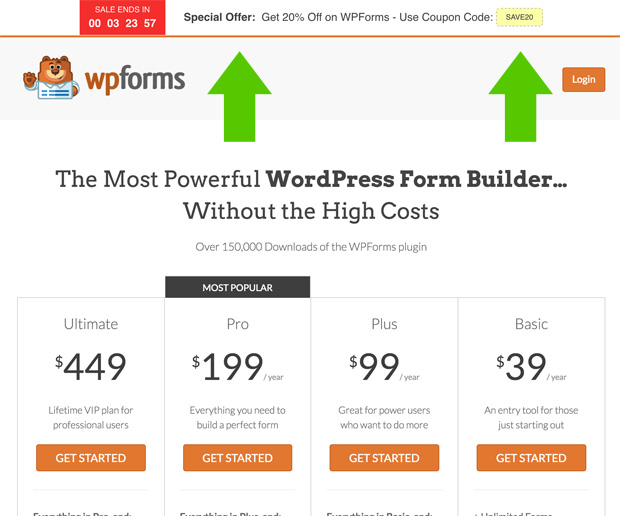
Floating bars are non-intrusive but still ensure maximum visibility for your opt-in form.
Using them in combination with a countdown timer helps to convey a sense of urgency and fear of missing out in your visitors.
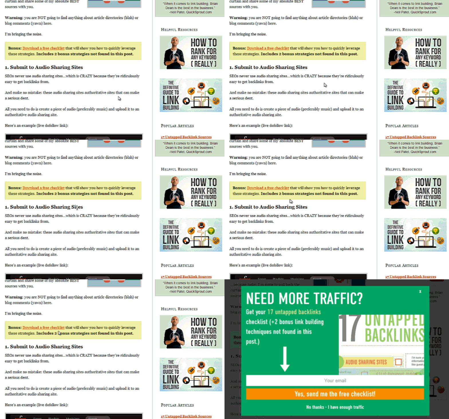
Content upgrade opt-in
Content upgrades are lead magnets (or opt-in bribes) that are created specifically for a particular blog post or page.
The content upgrade pop-up has a two-step opt-in process. When a user clicks on the link or an image, a pop-up opens up asking them to subscribe. If done right, it can help to increase conversions by 845 percent.
Write compelling copy
Once you’ve got an eye-catching form design and the right opt-in type, the next goal is to entice readers to sign up to your list with compelling copy.
Offer a high-value incentive
To grow your email list, your incentive doesn’t have to be huge or expensive—but it should be perceived as high-value.
How can you increase the perceived value of your offer?
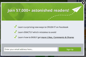
Use numbers: For instance, you can tell how many readers have already joined your list. Another commonly used strategy is to specify the dollar value of your offer.
Use images: If you’re offering a free newsletter course, you can increase its perceived value by showing the free course as a bundle of books and CDs. Another idea is to use your own image in your form and tell them you’re revealing insider secrets in the course exclusively to subscribers.
Solve a pain point
Solving a specific pain point is one the best ways to encourage leads to subscribe to your list.
The QuickSprout form above promises to “Double Your Traffic in 30 days.” This is an irresistible offer because it solves a problem specific to their audience.
Create an irresistible call-to-action
Even a well-designed opt-in form can’t convert if your call-to-action isn’t working. Let’s take a look at a few actionable tips for creating an irresistible call-to-action.
Write compelling copy
According to a Formstack survey, little changes in the button copy can increase conversion rates tremendously.
They found that conversion can be doubled by making the button copy clearer. For example, instead of saying “Submit” or “Send” in the button copy, it’s more effective to say “Submit Application” or “Register Now.”
Test your button design
Let’s take a look at an interesting case study below.
In this test, two pages were used. The original used a green button color and the variant used a red button. At the end of the test, they found that the red button increased conversions by 34 percent.
This doesn’t necessarily mean you should make all your CTA buttons red. Instead, you need to be sure to test your CTA to find what works for your target audience.
Every website is unique. Instead of blindly following any tactic, it is better to test each one and stick to those that best resonate with your audience.
No matter what, opt-in forms will always have some sort of friction that keeps your visitors from subscribing. But with an irresistible opt-in form design, you can reduce that friction and convert visitors into subscribers.
Syed Balkhi is an award-winning entrepreneur and online marketer. He is the founder of a lead generation software, OptinMonster.

