As a business, standing out is imperative—otherwise, how is anyone going to know who you are or what you do.
One of the best methods to make your business instantly more eye-catching, approachable and engaging is designing an effective logo. Now, the key word there is ‘effective’—there’d be no point having a beautiful logo that’s unrelated to what it is you do. If someone saw it, they wouldn’t have a clue as to what you’re trying to show them.
Designing a logo effectively is therefore much easier said than done. It requires planning, creativity and—in most cases—a lot of trial and error. Fortunately, we’re here to guide you through the process.
Follow these 5 tips and you’ll be able to create your very own eye-catching logo that expresses your brand.
1. Make it memorable
If you think about Apple, Google or Nike, they have instantly recognizable logos. This is because they’re designed in such a way to be memorable—sticking in your mind, even though you don’t intentionally mean them to.
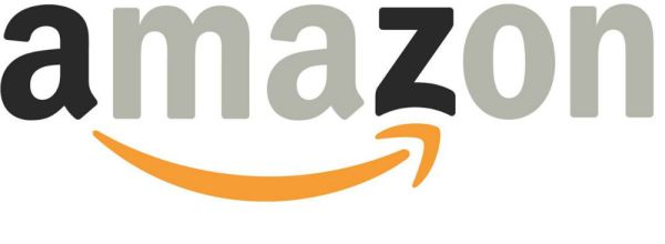
One particularly effective way to make sure your logo is memorable is by incorporating a visual double entendre. What I mean by this is an image portrayed in such a way that it could mean 2 different things. The Amazon logo, for example, utilizes this idea.

This logo features an arrow underneath its main text to indicate a smiley face, but it also highlights the fact that it sells products beginning with letters A to Z.
2. Color can be your bestie
The correct or incorrect use of color can make or break a logo. Just take a look at the Zion logo below. The rich colors it uses really help it to stand out, drawing you in to read the text.

When you compare this to a grayscale version of the same logo, it just doesn’t have the same effect.

Think about the colors you want to use, but make sure they don’t come across as overpowering or distracting. If you plan to use your logo on your website or bespoke-printed business card, you should make sure it complements the color palette you decide to use, otherwise the whole thing could just look a complete mess.
3. No one likes a copycat
While it’s perfectly acceptable to borrow ideas from other companies, don’t just copy them outright. As we’ve mentioned, a good logo needs to be memorable so, if it looks the same as everyone else's, then it's just going to get lost in the background.
Think about what it is your business does and get creative with how best to put that across to people. Make it unique to your brand, and don’t worry if it looks different to others. If it does, that’s probably a good thing.
Thanks for the mention, @USATODAYmoney! We love seeing how technology can help small business owners succeed. https://t.co/PTzzGgFQAH
— Keap (@KeapGrowing) October 24, 2019
4. Simple = super
When you think about the Apple logo, the idea behind it is so simple yet so effective. Put simply, it’s just an apple with a bite taken out of it—nothing special right?
Wrong. The logo works because of the bite taken out of it. Add the bite back in, and it’s literally just a boring, gray apple. But when you take it out, it adds character and drives a deeper meaning. It also provides another visual entendre, since Apple sells computers and there has been a bite—or byte— taken out of it.
Try to think of ways you can transform your company’s logo into something much more iconic. Even the tiniest detail can make the biggest difference.
5. Don’t be negative about negative space
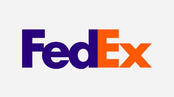
I would happily bet money that you’ve never realized that there’s actually an arrow hidden in the FedEx logo. I’ll give you a minute to spot it.

Got it? Good. Now I can make my point about how great negative space is.
Negative space doesn’t have to be negative—you can use it to your advantage to create an image that isn’t always immediately obvious. It almost works like an optical illusion, like the Cork & Cow logo below shows as well. While the cow’s horns may be the first thing you see, there’s also a wine glass hidden between them, utilizing the rest of the logo’s negative space.
However you decide to design your logo, there are 3 key things to remember: make it memorable, make it unique, and make it your own. If you don’t, you could go down with these legends as 1 of the worst logos ever designed.


