A good indication of a successful ecommerce website is reflected in its navigation. Are your products easy to find or are you “burying the lead” as they say?
Regardless if your site is accessed via desktop, tablet or mobile, cater to the design of each device respectively, which means you need to make an effort to have responsive design so shoppers can access your webpage anywhere, anytime, without missing features or deals.
Make your ecommerce site a convenient tool for customers to find the product they’re looking for. You want your customers to associate your website with a safe space they can rely on as you capture repeat business and enjoy a steady clientele.
Here are five of the best ecommerce navigation designs that will improve the customers’ experience and substantially increase your conversions:
1. Make parent categories prominent
Upon clicking onto your ecommerce platform, make sure customers can see the main navigation bar with the parent categories near the top of the page. Use a handy keyword tool such as Google AdWords to come up with common searchable terms to choose your categories, which will increase the chances of your website landing within the first 10 searches on Google.
Depending on your business, the keywords will also give you an idea of how to label your navigation bar based on customers’ needs. Why are they visiting your site? Make it worth their while and bring them directly to the source.
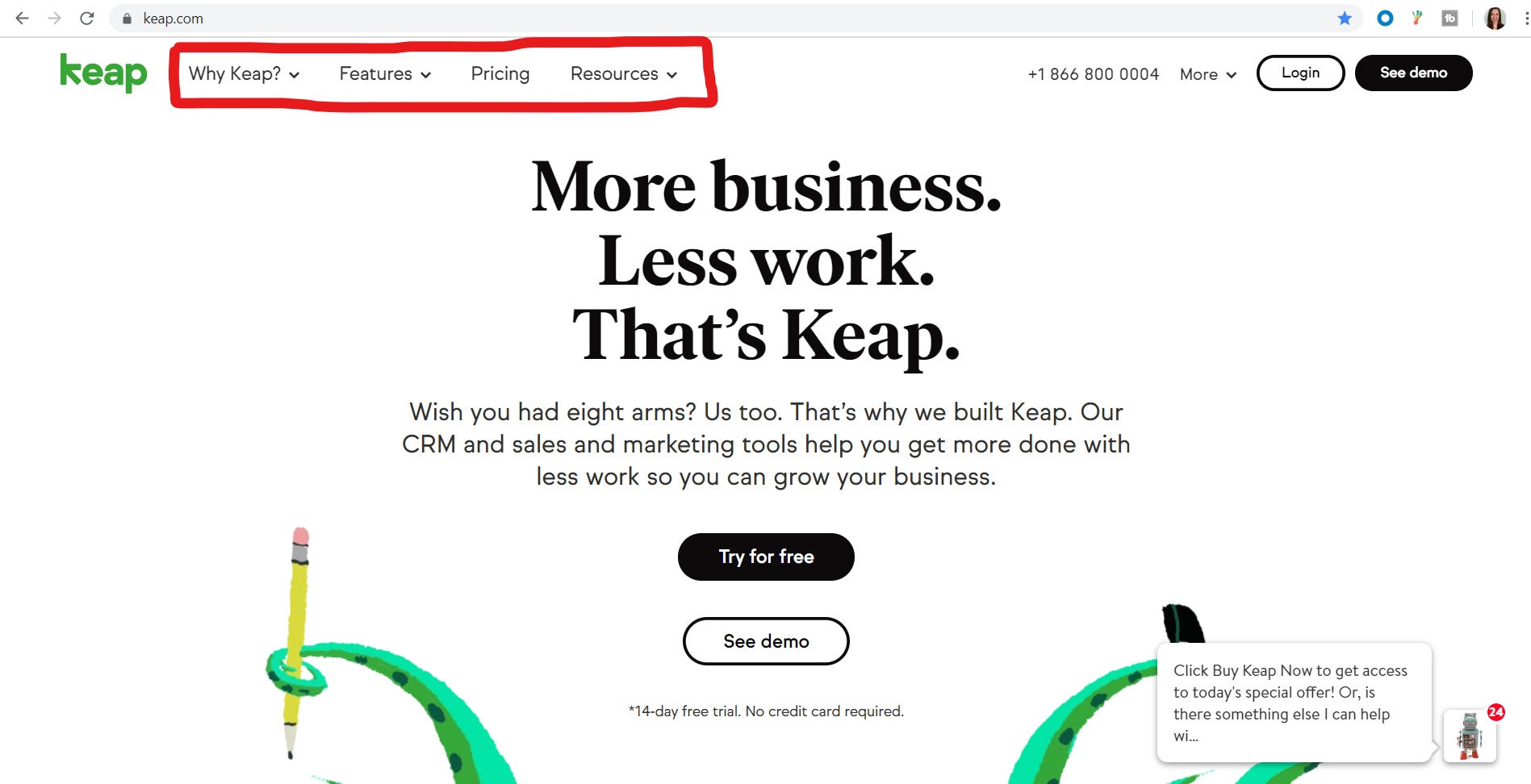
The example above shows Keap’s navigation bar separated into four concise categories with dropdown menu options. Try not to complicate the navigation bar with too many categories. That’s what the dropdown feature is for. The dropdown feature is a great way to indicate there’s more to see without cluttering your homepage with too much text, overwhelming your customers.
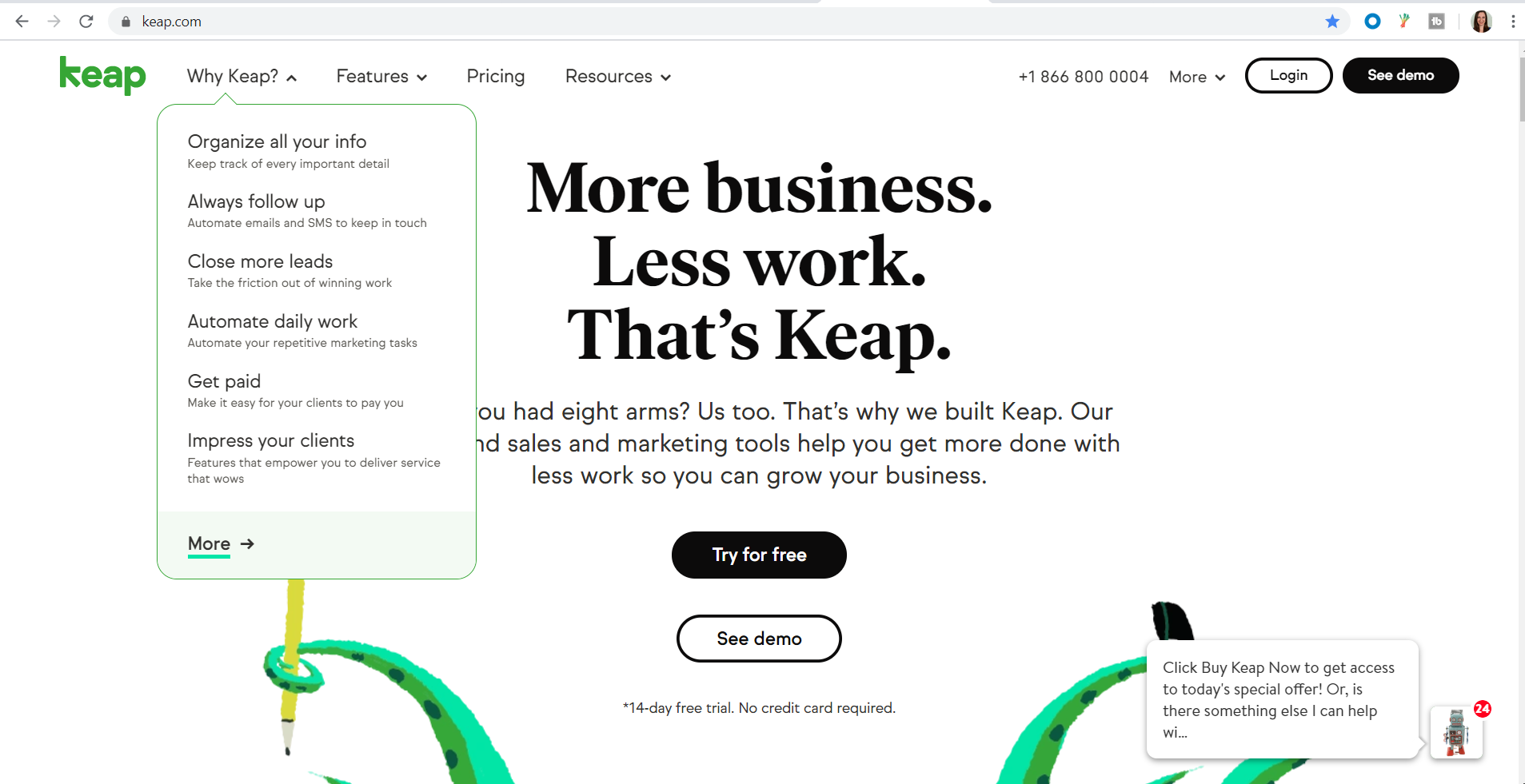
The example below shows how you can take customers down one more level into your business, introducing them to another dimension of possibilities. That’s where the subcategories come in, helping your customers refine their search by narrowing their shopping options even more.
2. Introduce your subcategories
As opposed to the generic nature of the parent categories that introduce the broad range of products you have to offer, subcategories allow you to be more specific with filtered options in an effort to save space on your homepage, yet create the opportunity for more time on site with enhanced click-throughs for better metrics and conversions. A great way to do this is to program the hover method onto your site.
For instance, Chewy, a website for pet supplies, labels one of its parent categories “shop by pet” and leads to a dropdown menu according to the type of pet you own: dog, cat, fish, bird, small pet, reptile, horse and then, pharmacy, which shows up in the navigation bar as well as the dropdown menu, emphasizing its importance to pet owners.
You’ll see an expanded menu describing the different products your pet needs for everyday living, such as "food," "treats" and “supplies” when you hover your mouse over the subcategory “dog” to the left, saving a significant amount of room on the landing page, but still including the necessary products in an organized and easy-to-navigate fashion.
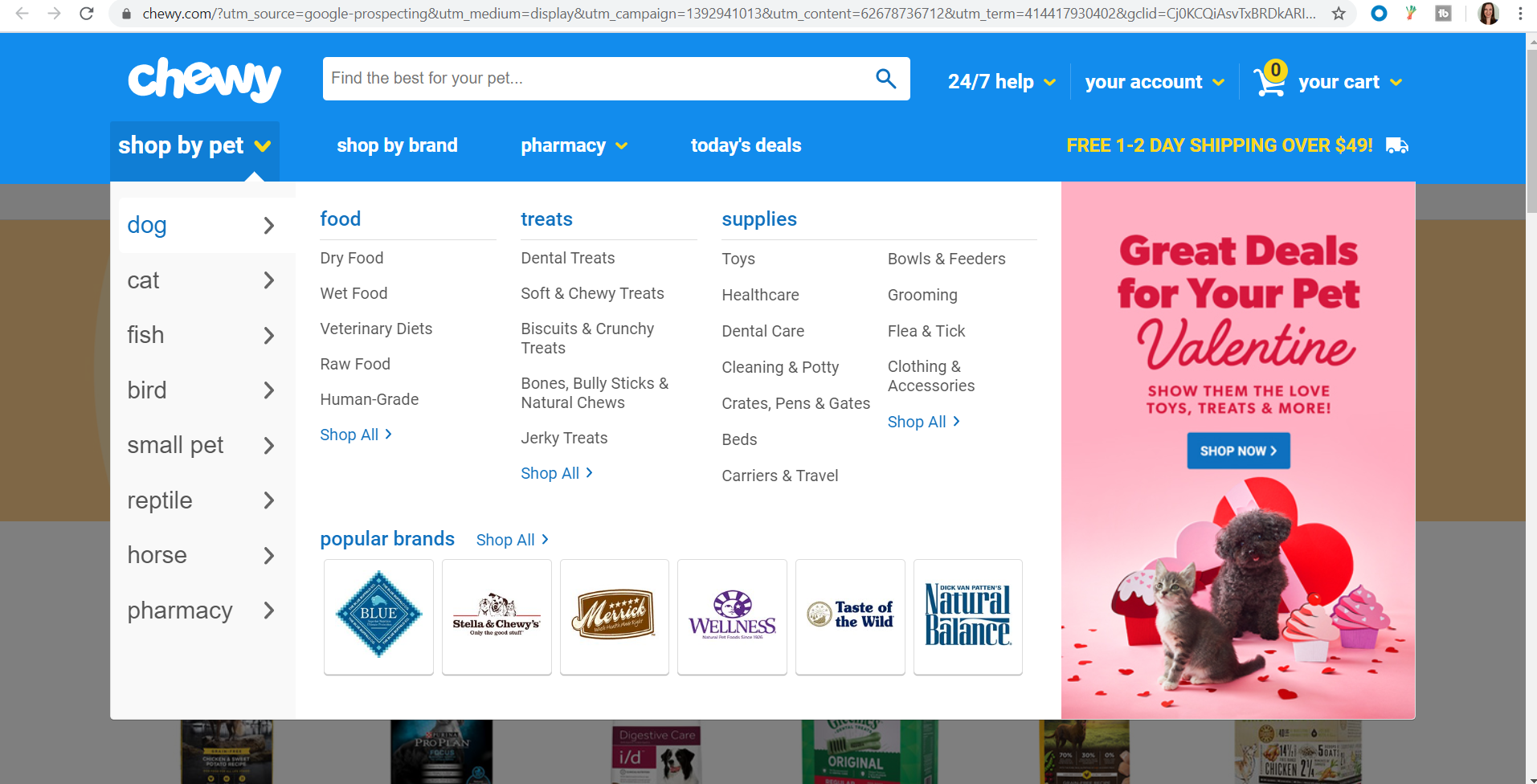
You can also use your expanded subcategory menu to display a special promotion you have going on, much like Chewy did with its Valentine’s Day deals, discounting certain products you can buy to show your love for your pet. Hence, celebrating Valentine’s Day doesn’t just have to be limited to humans, a very adorable and clever marketing idea.
3. Have a category just for new arrivals
When you start to build a rapport with repeat customers who are becoming more familiar with your brand and are developing an affinity toward your products, having a “New Arrivals” or a “What’s New” category as part of the website navigation bar will indicate that you refresh your inventory on a consistent basis.
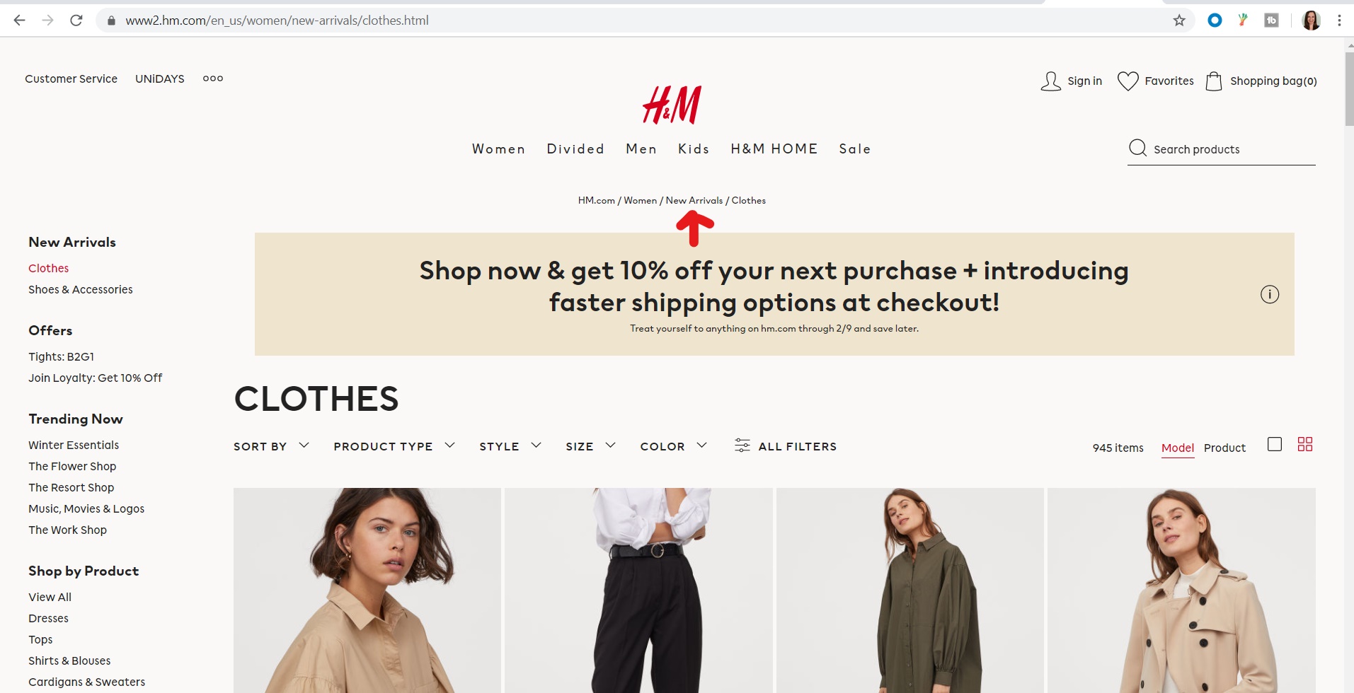
Looking at H&M’s site as an example, its “New Arrivals” section (seen at the top of the page and on the left rail) makes product browsing and site navigation even easier for customers.
Additionally, a "New Arrivals" category is helpful for brands selling seasonal merchandise, such as holiday items or produce.
Aside from a "New Arrivals" or a "What’s New" category, consider including categories for clearance items, sales, discounts and specials. This will make it more easily accessible for your customers to find a good deal upon entering your site, increasing the chance of more conversions.
4. Include a noticeable search bar
One of the more effective elements of efficient site navigation is having a prominent search bar on your homepage for your customers to use.
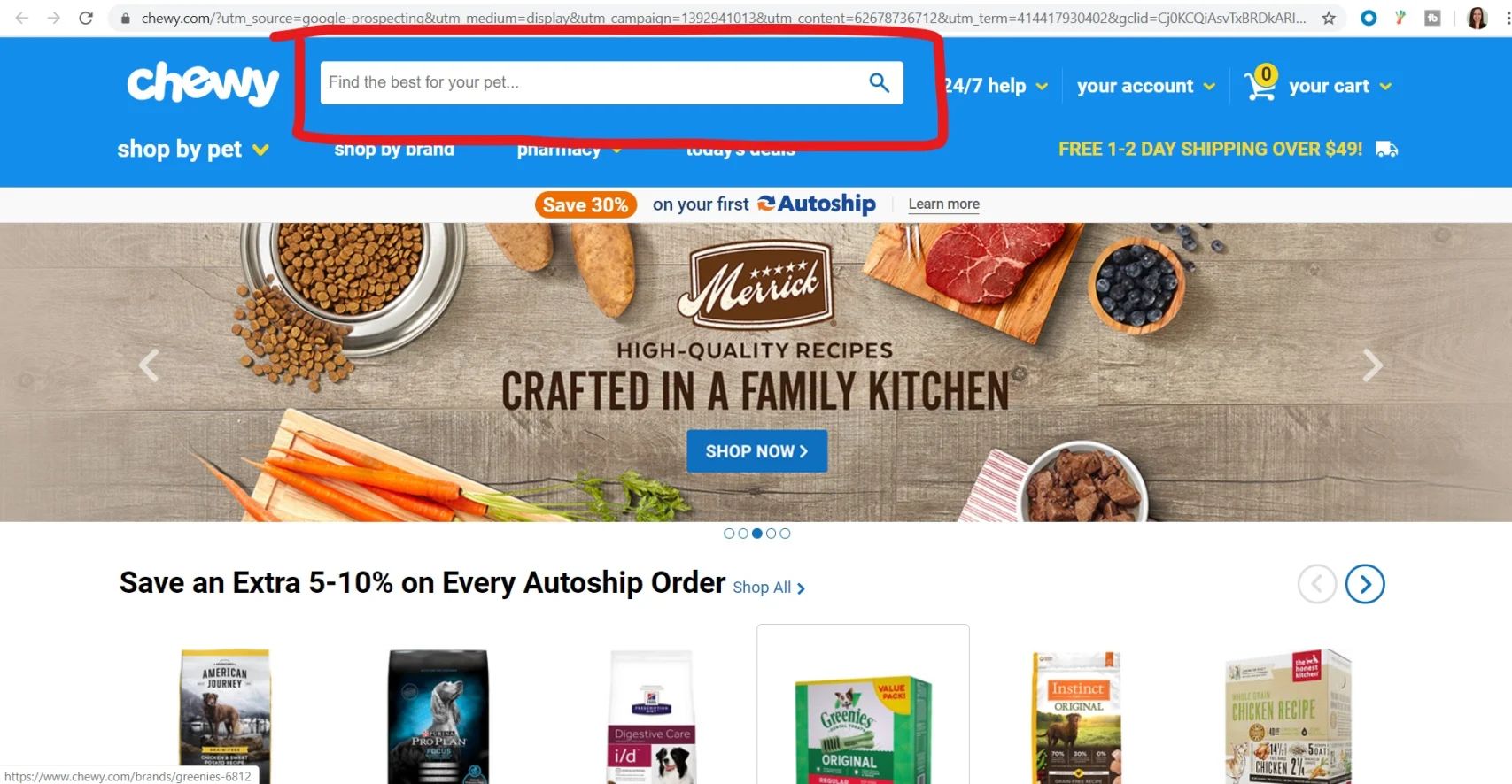
Looking at the example from chewy.com above, you can clearly see its search bar placed prominently at the top of the page toward the center with a call-to-action (CTA) inviting visitors to “Find the best for your pet…” which is a nice touch rather than including just the generic “Search” prompt. Be creative by having it reflect your brand or the array of products that you offer.
One thing you don’t want to do is integrate the search bar as part of the navigation menu. Try to avoid surrounding it with different page elements as well, as these may compromise your search bar’s effect.
Ease your visitors’ search with autocomplete, which helps customers fulfill their search queries, saves them time, and ensures that an accurate search result will be returned in the instance that they may be unsure of how to spell the name of a certain product correctly. Not only is auto complete convenient for the customers, it fuels the probability of more complete conversions.
5. Stick to conventional navigation design
Creating a unique color scheme or background design on your landing pages is fine as long as you adhere to a navigation arrangement with which the majority of customers are already familiar, preventing ambiguity that may result from not being able to locate your merchandise.
There are typically two types of navigation designs you will find on ecommerce sites—site navigation at the top of the page situated directly under the search bar and company logo, and site navigation on the side of the page, most commonly known as the left rail.
When it comes to responsive design, some ecommerce platforms resort to the hamburger menu, which is most recognized by the three horizontal lines you see in the example below from Ulta’s layout seen on mobile devices:
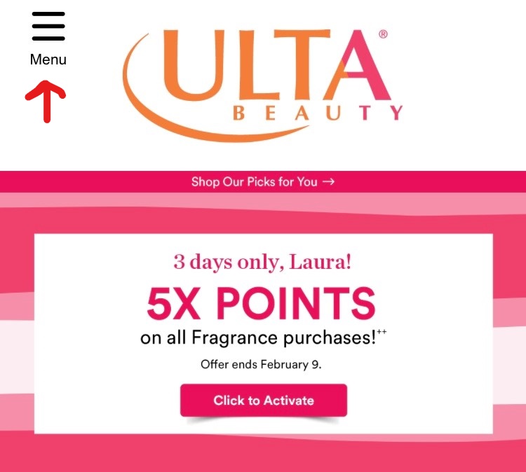
Users familiar with the hamburger’s functionality know it’s designed to open and reveal a number of hidden menu options in an effort to make the landing page easier to read and less chaotic on mobile devices. Once you expand the menu, visitors can click on the following:
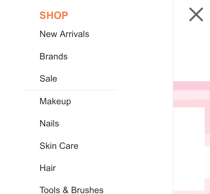
Once again, you’ll notice the “New Arrivals” as the top menu item, enticing customers to search for something in addition to the item for which they originally came to the site.
Creating the perfect site navigation for your customers will reveal how invested your brand is in their shopping experience. The more pleasant it is, the more likely your business will start to accumulate repeat customers who associate your ecommerce site with the convenience of being able to browse for anything they need 24/7.