By Jake Johnson, Creative and Content Director
Are you a designer or creative? See what positions we have available on our careers page.
Today, we complete the journey that started nearly two years ago of transforming Infusionsoft into Keap.
Changing the name of a company—especially one that has 17 years of history, 200,000+ users worldwide, and over $100 million in revenue—is not a light decision. Over the years, it had been discussed but the timing was never right, nor the reasons compelling enough. Behind the idea was a desire to become simpler both to use and to work with, and to expand our purpose to help small businesses succeed.
A little background
Over two years, multiple teams invested heavily in market and customer research to understand and define what challenges small businesses face in today’s world. We employed numerous quantitative and qualitative methods, including surveys, interviews, focus groups, diaries, and ethnographic studies.
The small business experience is chaotic (you probably knew this). We learned that customers expect more now more than ever. Small businesses work with multiple systems, relying on their memory, sticky notes, spreadsheets, and more to keep tabs on their customers. They have to be flexible, switching between follow-up and admin duties, doing the work for clients, and getting new business. Each day presents lots of interesting challenges.
Specifically, we learned that small businesses want more help getting organized for a very important purpose—to provide better service to their customers.
These findings led us to embark on a project to accomplish three things:
- Make our product easier to use, and provide a great experience for both SBs and their clients
- Make it simpler to work with us
- Expand our ability to help more small businesses succeed
These are an ever-moving horizon, and we’ll always strive to be better and set the bar higher. About six months ago, we started evolving our brand and our name to reflect the changes we made in the business and the product. The manifestation of that evolution is Keap.
Keap is our signal to the world that we’re on a mission to simplify growth for millions of small businesses. Our new name is a nod to the grit and perseverance of small business owners and encompasses everything we know to be true when it comes to success in today’s world: keep going, keep serving, and keep growing.
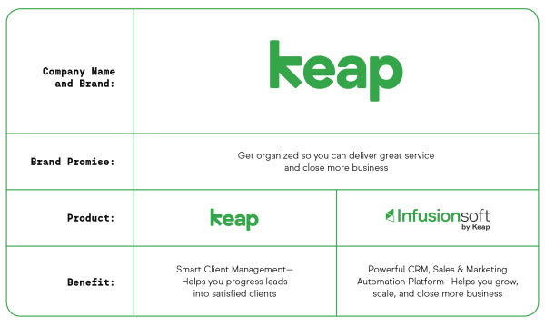
The Keap brand architecture
The name Infusionsoft served us well for many years. Our focus for the last decade and a half was on providing small businesses the best product in the market for advanced CRM, sales and marketing automation needs. And we still do that. Our flagship product, Infusionsoft, is now Infusionsoft by Keap.
There are some exciting plans to grow that platform, which G2 Crowd just awarded as:
- #1 Best Products for Sales (beating Salesforce CRM)
- #3 Top 50 Products for Small Businesses (beating Google Analytics)
Our newest product, Keap, builds on that foundation to serve even more small businesses. It is smart client management designed to help small businesses in the home, personal, and professional service industries progress leads into satisfied clients by organizing and streamlining four stages of work they do with their clients:
- Organizing leads: Capture, organize, and connect with your clients in one central place and on any device
- Getting the job: Take the friction out of winning work with online scheduling and one-click quotes and proposals
- Getting paid: Get out of bill collecting and get paid faster with easy-pay invoices and automated payment reminders
- Staying connected: Serve your clients with ease leading to more referrals.
Both of these products live under our corporate brand, Keap.
The Keap brand
For this project we had a great partner. Luke Hayman and his team at Pentagram worked with our in-house teams on everything, from brand architecture to our new name to our new brand system. It was a truly collaborative experience and one that we’re thankful for.
Going into the project, we had some guiding principles:
- Be simple and relatable to small business owners on Main Street, USA, not “Main Street, Williamsburg”
- Communicate the concepts of creating order and providing service
- Be human, not techy
- Represent our customers’ outcomes, not our own
The Keap logo
The Keap logo is simple and approachable. It is also memorable and ownable.
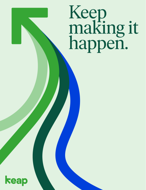
The Keap arrow
Embedded in the name’s natural form is an arrow, representing movement and flow—it even zigs when it’s expected to zag, as so many small business owners do.
![]()
We utilize this arrow as an essential component of our brand language to visually clarify concepts and add visual interest to the design. Arrows also represent an essential function of our customers, which is to move their clients along a path from prospect to satisfied client. Arrows serve as a guide, showing the way forward for success.
We use single arrows to illustrate direction or sequence.
![]()
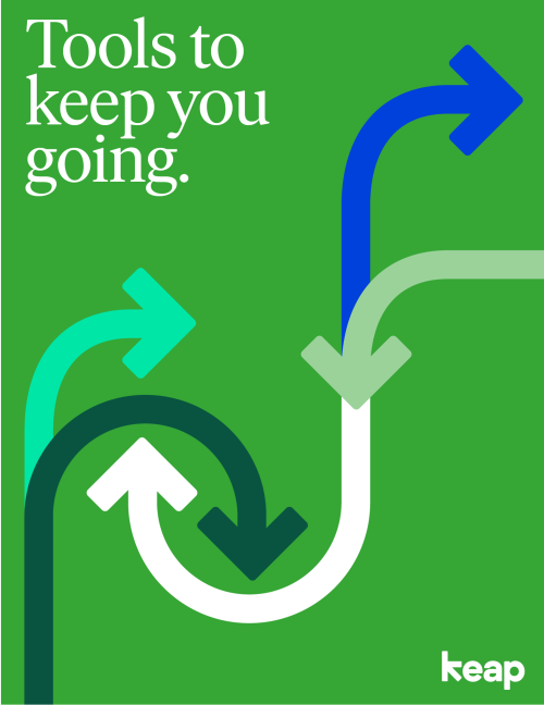
We also use arrows in arrangements to illustrate an idea or path of movement.

And finally, we use them to illustrate abstract concepts, like teamwork and complex systems.

(Plus, they’re a lot of fun to use.)
Color: A nod to history and a look to the future

Color is incredibly subjective, and when it comes to brand colors most people don't see them—they feel them. In a recent brand refresh, we tested the waters and made our website more accessible through high-contrast purple and bright blue—a move away from our traditional green.
Now we’re back to green. In the process of bringing the Keap brand to life, we learned that we had some things right from the beginning. Green embodied growth and the entrepreneurial spirit. It feels fresh and approachable. And it’s a color we owned in a sea of competitive blue and black.
Green is a nod to our past, but also a symbol of our future.
This time around, we’re using a brighter version better suited for a primarily digital brand. Keap Green is reminiscent of the lawns in front of every household: It’s a familiar and energetic color. Bringing in our learnings from our recent refresh, our palette supports the primary color with greater accessibility and subtle tones that play well together.
The result is a dynamic yet refined palette that brings in the best of our past with a strong look to the future.
A custom version of a beautiful typeface
Recent trends in branding include making your own typeface. While we didn’t go quite that far, we did work with Pentagram and foundry Letters from Sweden to create a soft, more rounded version of their typeface Ivar. The result is a serif that’s versatile at scale and friendly. It also gives a nod to the good-old-fashioned Times New Roman that so many small business owners work with day in and day out.
Secondarily, we use Sul Sans in smaller contexts and as a functional support to the primary serif. As our sans serif typeface, it makes dense body copy and the Keap interface readable.
And, hey, we got a monospace as part of the deal, which again is a lot of fun—and especially helpful for technical data.
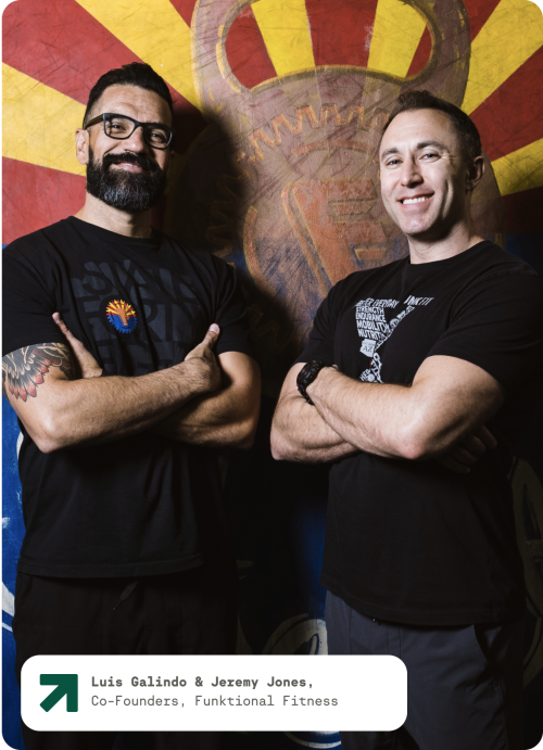
Bringing our customers to the forefront
A driving principle behind our photography is to bring our favorite people to the forefront: our customers. As much as we can, we have and will be doing custom photoshoots with crisp, directional lighting in the environment where they work each day.

The goal is to communicate their success and pride of ownership. Keap has helped them reach their goals and the photography should reflect their happiness with those achievements.

Simple, straightforward illustrations
Some concepts don’t lend themselves well to photography, so we also developed a straightforward and simple illustration style in conjunction with Pentagram and the Milan-based studio, LaTigre.