The purpose of a brand style guide is to ensure your company is promoted in the most homogeneous way on all platforms. It creates an understanding among employees as to how the brand is portrayed and perceived.
A brand style guide, which is also known as a brand manual, brand standards, or brand guidelines, is a document shared in-house with the rest of your organization that describes what perpetuates the brand’s identity.
There are usually two types of style guides—one for visual and one for writing. Writing instructs how the brand will look on a promotional platform, whether it’s a bus ad, graphic t-shirt, etc.
Visual sets the tone and voice for how your brand is portrayed in the media, i.e., what jargon constitutes your product.
Why make a brand style guide?
Providing your organization with a simple style guide takes the guesswork out of how to represent the brand. It creates consistency from specific shapes to specific hues.
It also makes a great standard operating procedure (SOP) manual for newcomers that will save time in training and give them easy access for learning how to depict the brand.
Whether it’s in the way of a blog posting, a digital newsletter, a baseball hat, or a bumper sticker, the brand style guide will direct internal and external users toward a consistent visual aesthetic anywhere the company logo appears.
Some simple style guide elements include:
- Logo requirements
- Logo color variations that have been approved
- Clear zone (the area around the logo that must be free of any other graphics or typography)
- Logo’s minimum size and placement
- Possible variations of logo (ex: horizontal or vertical orientation)
- Color palette guide (pantone/cmyk/rgb colors)
- Preferred fonts and heading sizes (establishing hierarchy)
- Application’s visual examples
- Examples of how it could be done incorrectly
A simple style guide also includes:
- Company’s mission statement
- Business background
- Copy and tone of voice
- Iconography
- Photography
- Patterns and textures
- Employee badges/clothing
- Social media icons
- Email signature
- Letterhead
- PowerPoint templates
- Landing page templates
Here are some well-executed brand style guides from successful companies:
1. Skype
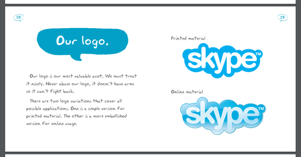
Skype’s simple branding style guide is a wonderful, playful take on the company’s theme and dynamic. Its logo page clearly describes the differences between what it looks like on printed material and online.
Take Keap's Lifecycle Automation Assessment to identify growth opportunities for your business.

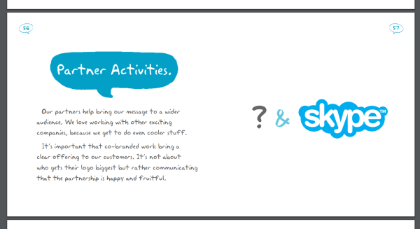
It even addresses co-branding and why it’s important that its partnership creates a good experience for its customers. If you’d like to read Skype’s brand handbook, download it here.

2. I Love New York
Anyone who has visited New York City has definitely seen the “I love NY” logo. It’s practically ubiquitous.
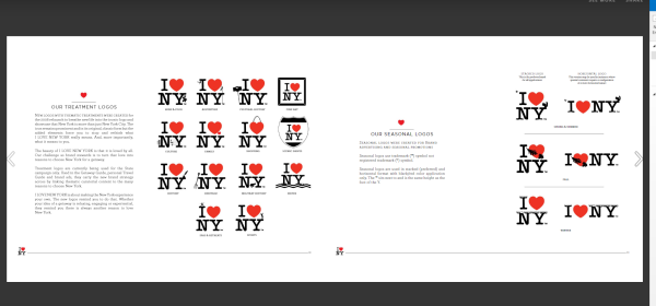
The guide is sleek, detailed, and presented in the form of an Issuu slideshow. It covers everything from typography to brand consistency in print ads to the logos’ thematic treatment and the simple brand guidelines template to go with them.

If you’d like to take a look at I Love New York’s brand guideline, you can download it here.
3. Netflix
Netflix’s logo is hard to miss and that’s the beauty behind its design. It’s eye-catching, iconic, and unmistakable in the age of streaming services. Netflix is the pioneer behind binge watching and yet has marketed itself so simply, but it makes a powerful impression.
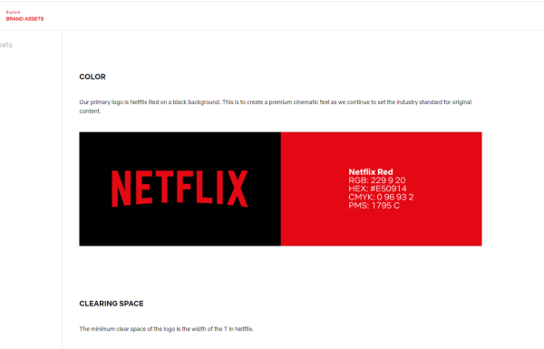
Its brand guideline revolves solely around its logo and the specs behind it.

If you’d like to learn more about Netflix’s brand asset guideline, click here.
Take away
Assembling a simple brand guidelines template could be an empowering and personal experience for your company. This is your chance to show internal and external individuals how you want your brand to look. The logo is the face of your business–everything from the color scheme, the slogan, the shape, could create an iconic piece of branding history. Who knows? Your company could produce something as memorable as the golden arches or an apple.


