You can't do business online without a landing page. It doesn't matter what business model you have; you need high-converting landing pages to drive conversions.
At the most basic level, a landing page is any page your visitor arrives at after clicking on an ad or link. More specifically, a landing page exists for the sole purpose of leading the visitor to take action—making a purchase, downloading a document, or providing you with their information for follow-up.
If your customers don't take action, you don't have a business. It's as simple as that.
Unlike the rest of your website, which can be informational, educational, entertaining (or all of the above), the goal of a landing page is singular: It exists to convert. Regardless of how much money you have put into paid advertising, and how much traffic it drives to your page, it is only well spent if that traffic takes the desired action. Creating a landing page that results in a high conversion rate takes forethought, strategy, targeting, and goal-oriented focus.
But don't take my word for it. Here's the proof: The guys at Conversion Rate Experts generated the $1 million for Moz with just a single landing page, a magnetic call-to-action (CTA), and a few emails.
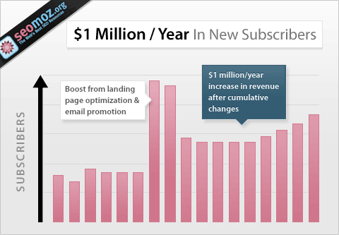
Your results may vary, but creating a landing page is the foundation of any online business—if you want long-term results.
Don't be like some marketers and businesses that invest a lot of resources to drive traffic and prospects to their websites with the hope of getting a percentage of these people to respond to their offers.
It doesn't work that way. You need a standalone page with a single purpose—capturing email leads and sending prospects and customers into your sales funnel.
Creating the perfect landing page isn't for the faint-of-heart. There are dozens of different elements to have in mind, a whole science of psychology hidden beneath the surface, and the fuzzy idea of "what the customer wants" grumbling in the background.
So the team here at Keap and I put our heads together to create this comprehensive guide to simplify and streamline the process for you.
In this post, you're going to learn exactly how to build a landing page to grow your email list faster than ever.
Building an effective landing page 101
Building a landing page is so easy, software can do it. Building an effective landing page, however, takes some effort.
Your landing page should show your visitor exactly what to do. They shouldn't have to think about next steps. The page should guide them directly through the process of doing it.
Let's look at the anatomy of a landing page that accomplishes this.
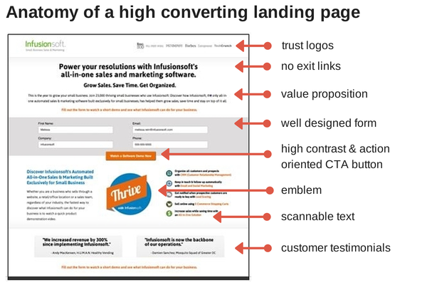
Note that every major element on the page is either a design element or a copy element. These two things—copy and design—need to be effectively done in their own right, but they also must work together to create landing pages that convert.
Landing page design essentials
When designing a landing page, be intentional and to simplify your designs whenever possible. Focus on creating a clean design with a clear pathway of information for your visitor's eye to follow.
Avoid horizontal rules, which can break a visitor's path, and create a balance between valuable information and white space.
When in doubt about a page element, ask if it supports or obstructs your customer from completing your desired action. Don't place hurdles between your visitor and your CTA.
Keep it above the fold
In website design, being above the fold corresponds to everything on your page or site that your visitor can see without scrolling.
For landing page conversion, if your visitor doesn't see it, it doesn't exist.
As much as possible, keep your brand, headline, CTA, and trust information above the fold. Now, this is much trickier due to the rise of hundreds of screen sizes necessitating responsive web design. So, when you design your landing page, keep screen sizes in mind.
Focus attention with images
Use images wisely to draw the eye of your visitor in the direction of your choice. Use an image in which the subject's eyes or position are directed toward your call to action, or make use of a directional graphic like an arrow. Directed imagery and graphics are a proven way to help guide your visitor to take the action you prefer. (More on this in the "Trends in landing page design" section below.)
Eliminate the exit
In contrast to most of the advice given on web design, when it comes to landing pages, full navigation is not necessary. Your landing page should exist outside of the normal framework of your site and give your visitor only one choice of an exit link—your CTA.
Use video, correctly
Video can provide a dynamic and personal addition to a landing page. However, if used incorrectly, motion can be dangerous. Be sure to give your customers control of the experience by keeping videos to 60 seconds or less.
Landing page copy essentials
An optimized landing page should have clear and concise copy. Make sure your copy is easy to scan, uses bulleted copy blocks and a clear, sequential thought process. It's about what you say…and how you say it.
Your copy should be relevant, clear, and convey a sense of urgency while avoiding sources of anxiety and distraction. It should be focused on the benefit to your customer and speak directly to their wants and needs.
Be sure your copy clearly communicates your value proposition, and pay special attention to point-forward headline construction, which places the benefit at the beginning or end of your headline, where your visitor is most likely to read it.
All call-to-action (CTA) buttons are not created equal
Your call-to-action buttons has the opportunity to be much more than a place to say "submit." Use action-oriented language that addresses both your visitor's motivation and the result of clicking the button. Words like get, view, enjoy, or activate,_which focus on what your customer will receive, are much more powerful than _submit, start, or _pay,_which only focuses on what your customer must do.
Less is more
When it comes to forms, ask for only the information you actually need and structure your form so the easiest information for your visitor to give appears first. Make it as easy as possible for prospects to provide you with the information you need to move them from visitor to customer.
When considering additional fields, ask yourself if the additional information is worth the risk of lower conversion.
Here are some simple guidelines for better forms:
- Use top aligned labels to create clarity
- Clearly indicate required fields to minimize customer confusion—an asterisk is not enough
- Never place text inside the field—it will disappear when your customer starts typing, potentially leaving them confused about what information is required
Landing page trust and reliability essentials
One of the easiest ways to decrease visitor anxiety is to use proven trust essentials prominently on your landing pages.
In logos we trust
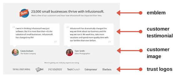
As consumers, we trust the perception of reliability that a logo brings. Adding an "as seen on" or "featured by" section increases social proof, communicating to your customer that you are worthy of their trust.
Feature customer logos or expert validation logos prominently on your page, above the fold, and near your CTA button.
Utilize customer love
Testimonials from happy customers also help drive sales. Use positive quotes and reviews from real customers to showcase your trustworthiness.
Use images of real customers alongside their words to further personalize the testimonial.
Don't forget an emblem
Creating an easily recognized, on-brand emblem can aid in reducing anxiety, help to quickly communicate ideas, and create a focus on your call to action or value proposition.
The 6 Critical Landing Page Components
Landing page trends come and go—but some components will always be critical to conversion.
With the basics of an effective landing page under your belt, let's explore the six most critical landing page components—and how to use them to create landing pages that convert.
1. Killer headline
The headline is for capturing the attention of your ideal audience. It's the most important element on your landing page.
According to Ted Nicholas, "73 percent of buying decisions are made at the point of the headline." Brian Clark, founder of Copyblogger adds, "8 out of 10 people will read your headline."
The headline is the first and most critical call-to-action of a landing page. The headline of your landing page should accomplish the following:
- Capture the reader's attention
- Inform and educate the user about the offer
- Be short and precise (with no more than 20 words, and preferably no more than 10)
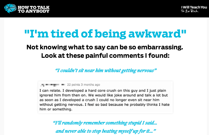
For example, the landing page below was created for a social skill online course. The headline highlights the major problem that the course solves. Upon visiting the page, readers will immediately know the challenge that they will overcome.
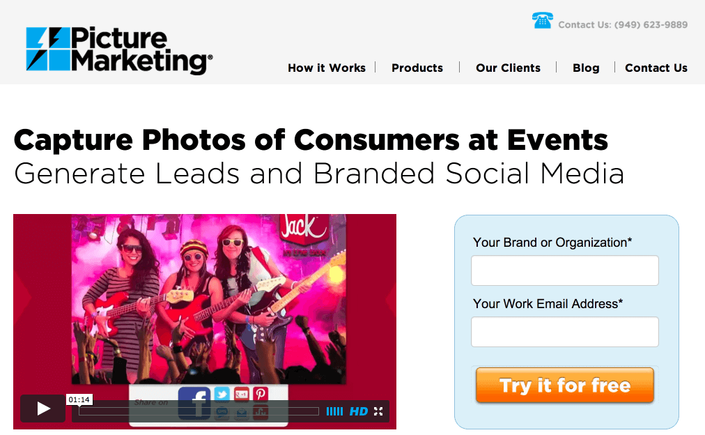
Similarly, notice this headline from Picture Marketing. It identifies precisely what the service is meant to offer. Mission accomplished!
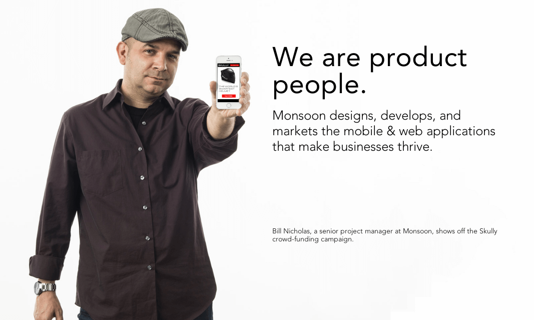
In another example, Monsoon uses a short, attention-grabbing headline, then immediately supports it with a subheadline. The clean design of this landing page gives more power to the headline and image.
Here's the lesson: Rather than trying to be clever and creative, write a clear, attractive and benefit-driven headline. You'll get better results.
2. Irresistible offer
No matter how compelling your headline is, don't expect your landing page to convert well if your offer sucks.
What exactly are you offering people on your landing page? Is it an e-book, software, a membership access, swipe file, discount coupon? Be clear about it.
One of the reasons why a lot of good-looking landing pages don't convert is that the offer doesn't resonate with the target audience.
You must offer something of value—even when you're not charging for it.
And no, "subscribe to my newsletter" is not often a valuable enough incentive.
Ask yourself this question and be honest with your answer: Why would someone sign up for your email list and not your competitor's?
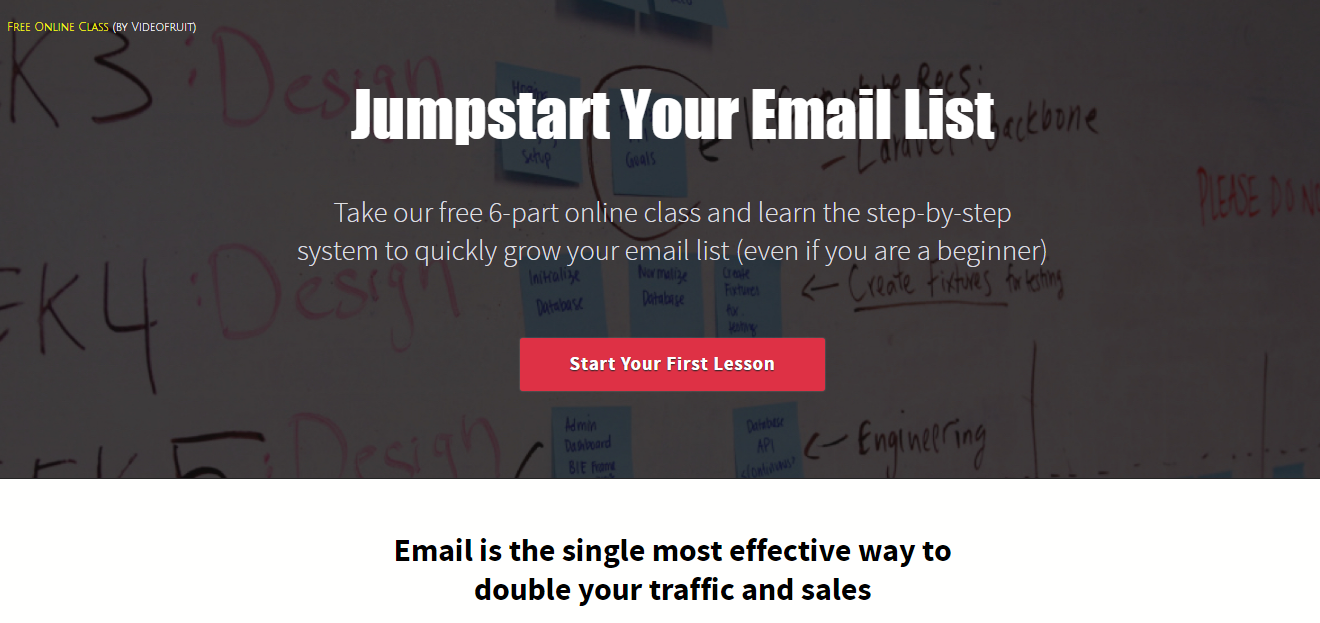
Bryan Harris's Videofruit landing page is a good example. It offers a free six-part online class on how to build an email list. Anyone who's struggling to build an email list will jump at it.
Whatever you decide to offer, make sure it's so irresistible that it'll be difficult for your target audience to pass by.
3. Attractive subheading
If the headline makes the prospect to look, then the subhead should make them stay. A good subheading will help remove the objection or questions that the prospect has. If the main headline isn't clear enough, the subheading will quickly tell the prospect or customer what the offer is about.
For better results, follow these best practices:
- Place the subheading directly beneath the main headline
- Make it persuasive enough (this would inspire your ideal customer to read the entire copy)—with the concept of the headline, your subheading should be able to push it a little bit further
- Write a more detailed subheading that complements that main headline
Check out this example from Sumo. The company used a subheading to clarify the offer and make it more compelling.
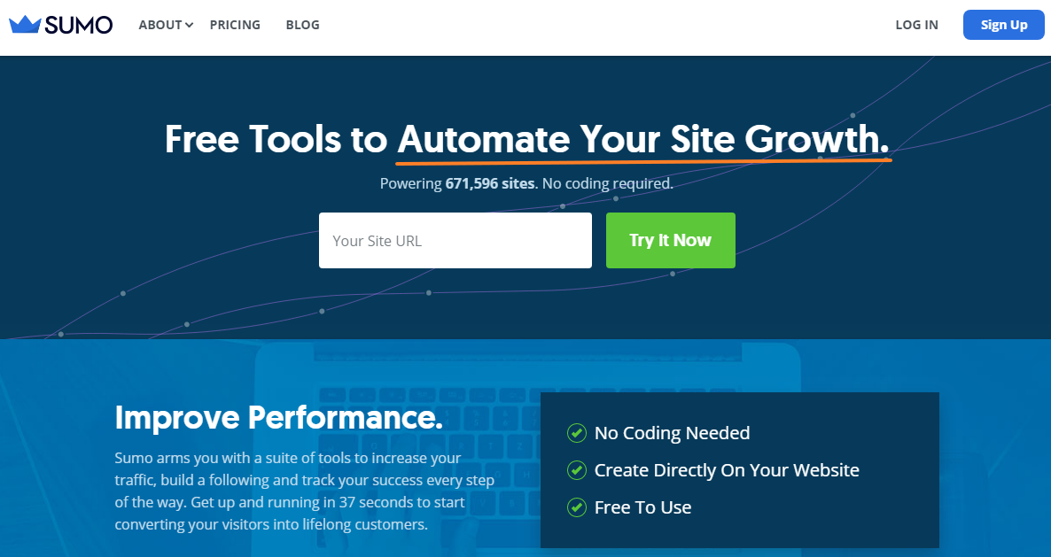
The subheading should be used to convince those who are on the fence to come onboard.
4. Trust indicators
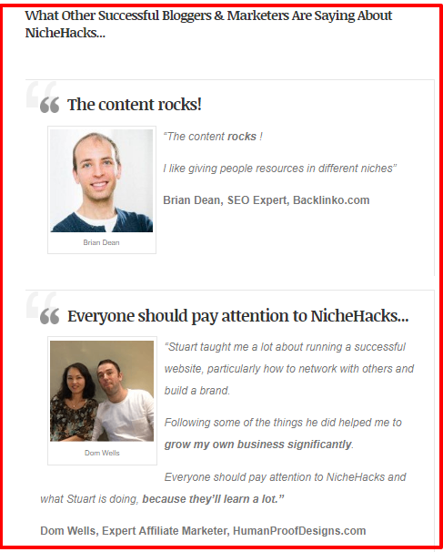
A perfect landing page makes good use of elements that tell the users the offer and brand are trustworthy. Trust indicators can come in different forms. One of the most popular types is the testimonial.
Testimonials serve as a social proof for improving lead generation. They capitalize on word-of-mouth to reassure users with endorsements from past customers, as you can see from the screenshot below:
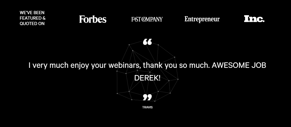
Similarly, another powerful trust indicator you'll often find on landing pages that convert is the trust badge.
Trust badges refer to the logos and trademarks of famous or popular brands you've worked with in the past. They serve as endorsements of your trustworthiness and expertise.
5. Eye-catching graphics
Eye-catching graphics can emotionally compel visitors to take your desired action, and they create a better user experience. According to Content Marketing Up, about 40 percent of people respond better to visual information than to the regular text.
Neil Patel tested this with a hand-crafted illustration for his About page and saw tremendous results in conversion.
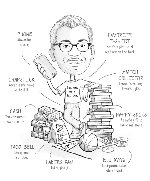
Here is another interesting fact: The brain processes images 60,000 times faster than plain text. In other words, a visitor will be drawn to the graphics on your landing page immediately. So make it appealing and use high-quality visuals.
When you're considering what type of image you should use on your landing page, keep the following in mind:
- Images should be highly relevant to the offer. For example, if you sell physical products, your landing page should contain an image of the product
- If you're offering a service, then the primary aim of the image should be to capture attention—and demonstrate relevance to the service
- Ensure that all images are high-quality
**Note: ** Avoid using stock photos on your landing page. Why? Because hundreds of other websites are already using them. Use your own photos when possible.
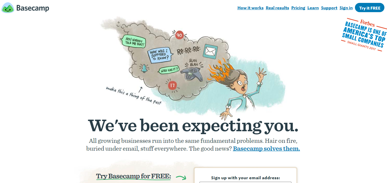
An excellent example of a company that's leveraging graphics properly is Basecamp. The website uses hand-drawn illustrations to show the functionality of their product and to help explain it better. As you can see in the screenshot below, these photos are fun and attention-grabbing.
6. Call-to-action
The CTA button requires its very own section because just like every other element mentioned here, it's critical to get this right on your landing page.
Your CTA button must stand out, and not blend in. In other words, it should not be part of the upholstery. It needs to pop.
For example, take a closer look at these two buttons below. Regardless of your color preference, which of them jumps out at you more?


The first is undoubtedly an action color, while the second blends in with the page.
Marketers use action colors on their CTAs to catch the prospect's attention and draw them towards the desired goal (i.e., to click the button).
Trends in landing page design
You're about to set up a landing page for your newest campaign. You've spent hours tinkering with the ideal copy that lures your reader towards action—but what about the landing page design?
Images have a powerful effect on our brains—and the logic here lies in psychology and brain science.
According to molecular biologist Dr. John J. Medina, if you hear a piece of information you're likely to remember just 10 percent of the information after three days—but add a picture and you'll remember 65 percent of the information.
Another benefit? Images add "truthiness" to information. One study shows that the mere existence of a photo (even it was unrelated to the topic of the words) increased people's perceptions that the statement was true.
The halo effect
On top of that brain science, we have the simple—some may say evolutionary—preference for images of babies and beautiful women. This preference is hardwired into our brains to capture our attention.
Beautiful people, in general, kick our human psychology into gear. Billboards are adorned with beautiful people to trigger the Halo Effect, where we naturally associate good looks with the quality of the brand being displayed.
This isn't an excuse to foray deep into stock photo land—but you also shouldn't just include a photo of a pretty person if it has nothing to do with your brand: relevance is king.
Where are they looking?
This is your mantra in landing page design: All eyes must lead to the call-to-action.
For example, if you're a cloth diaper company, as you place an image of a baby on your new landing page, think about where that small human being's eyes are looking on the screen.
Is the baby looking at your CTA? Then you're good to go. No? Flip the photo or pick another one.
Studies have shown that the direction of gaze plays a major role in our reactions as viewers. Just as we follow another person's eyes in real life, when we look at web images, we follow directional cues.
So make sure your baby is staring right at the "buy it now" button.
Reflect your customer's needs
Who are you selling to, and what image will they identify with the most? Get into the head of your buyer persona. Take, for example, the experience of Jesse Harrison, the founder and CEO of Zeus Legal Funding in Los Angeles. She's in the lawsuit funding industry with a target audience that is a lower income demographic and uses Zeus' services to help pay for daily expenses during a lawsuit.
"When we first made our website, the person on our homepage was a white male, and we would get maybe two calls a day," says Harrison. But when they changed the photo to a picture of an African American woman, a major transformation occurred. "We started getting about 10 calls a day. The conversion rate also increased from about 30 percent to 50 percent," says Harrison.
Use real people
Studies show from the Nielsen Norman Group shows that people prefer photos of real people over stock images. This is part of a wider trend of consumers wanting transparency and to know the humans behind the company.
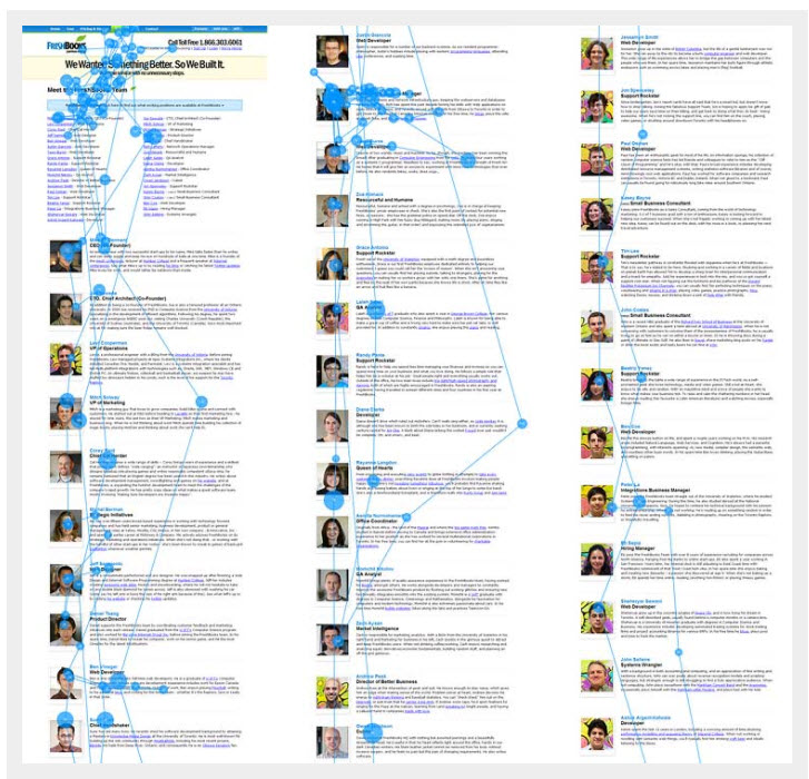
Lisa Chu owns BlackNBianco, a website that sells tuxedos for children. She recently decided to ask her customers to send in their photos of kids dressed to the nines. She uploaded a banner to the homepage, offering a 20 percent discount if customers sent in their photos of their smartly dressed kids in their products. She said it was an exercise in "building credibility with our audience by showcasing happy customers."
It worked. Her conversion rate shot up from 2.8 percent to 7.2 percent. "I learned from experience our customers want to see real photos of real kids wearing our products," says Chu. "It will give them an idea what the outfits will look like on their kids. Every industry is unique and understanding your audience is the catalyst to creating banners, images, and a website design that will trigger your customers to make a purchase."
Don't forget about the product
Of course, photos of people are not always the best route. if you're selling products, then a photo of a random beautiful person may just annoy your viewers. So invest in getting some spectacular, clear and helpful images of your products and/or team.
And if you're selling something specific, go the extra mile to get original shots. Bandwagon has developed an infographic that summarizes the powerful potency of images—companies that create custom visual content have a seven times higher conversion rate.
Video still wins
Don't stop with photography: Make sure that you fully investigate video, too. This visual form is taking the conversion power of images and massively multiplying it.
While you're getting that photographer into the office to take a few excellent, original images of your brand products and team, book in the videographer to spend some time there too. Invest in a professional, compelling short video that will capture the selling point and showcase the humanity of your brand.
9 Landing page optimization tips
Landing pages provide a way to feature new content and direct your target audience to a particular campaign. While many companies use them for marketing strategies, not every business is optimizing landing pages for maximum ROI from their marketing investment.
It's not rocket science to improve landing page conversions, however. These nine landing page optimization tips give you some simple changes you can make to create landing pages that convert like gangbusters.
1. Align landing page headline and body copy
Keeping the landing page headline and body copy aligned creates consistency and delivers a clearer message to the page visitors. In other words, the body copy should back up the claim of the headline.
An additional benefit of doing this is it may improve your Google AdWords score, lowering the cost-per-click.
2. Double-check your grammar
No one wants to come to your landing page and read content full of spelling and grammar mistakes.
Just because poor writing is rampant on the internet doesn't mean you need to follow suit. Have your copy double-checked by a second pair of eyes.
Or employ an app like Grammarly, which scans your work, points out potential mistakes and suggests improvements. If you use WordPress, you can find plugins that spot-check your writing, too.
These tactics help ensure a landing page free of errors, with well-written sentences that compel and convert.
3. Optimize form fields
Don't try to collect so much information in your landing page form that you discourage visitors from completing it. The less information you ask for, the higher your conversion rate will be.
While there is no one form that works for every company, plan to collect basic information such as name, phone number, and email address. You can also ask for mailing address, but this may be data you can live without—and asking your audience for it may be discouraging to them.
Some companies also take this opportunity to ask visitors to share what their main challenges are. Think carefully about your audience before deciding to do this. While the data might be helpful to you, will your visitors really appreciate having to spend the time and cognitive energy to give you that information while they're trying to complete your CTA?
4. Leverage trusted sources
Conversions are easier to achieve when the visitor already trusts you. While that may not be true just yet, the next best thing is to incorporate sources and experts who they do trust already.
Add written or video testimonials from influencers—like successful entrepreneurs or other industry thought leaders.
Guarantee seals, certifications, and third-party trusted brands like the Better Business Bureau can go far to improve your landing page, too.
Lastly, you can add links to press mentions that show media coverage of how you have helped others.
5. Share awards and accolades
There's nothing wrong with tooting your own horn. And, since a landing page is a place to illustrate your authority and build confidence in your ability, it's a smart move to add a visual display that shows recent awards and accolades.
Don't put so much on the landing page that it distracts from your main message, though. Select a couple choice awards, major brands that have partnered with you, or recent achievements. Try to use more logos and images than words for this section.
Build additional credibility in this section by linking out to the award or brand where visitors can verify that your accolades are legitimate.
6. Don't overlink
Most of the items in this section are things to add, but sometimes it is important to minimize what you are doing with landing pages.
This especially applies to links that you add into the written and visual content. Try to keep the outbound links to a minimum. After all, you don't want these potential conversions leaving your page before taking action!
The point is to keep visitors on the landing page as long it takes to sell them on what you offer. Only use links to cite any research you have included and link to any awards.
7. Add live chat
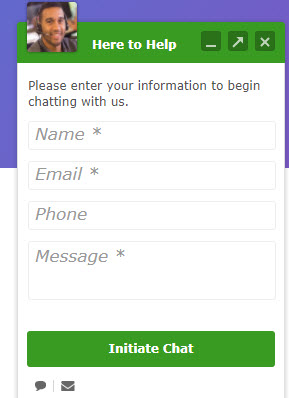
Live chat offers your visitors a way to ask questions—and get answers—quickly. Live chat is becoming more and more commonplace, and thus more expected.
- 51 percent of consumers say a business needs to be available 24/7
- 44 percent of online consumers say that having questions answered by a live person during an online purchase is one of the most important features a website can offer
- 92 percent feel satisfied when they use the live chat feature
The immediacy of communication will improve landing page conversion for visitors who want to learn more about your product or service on the spot. It's an easy option to give your audience and pays a significant return.
8. Focus on your call-to-action
Since the purpose of building a landing page is to convert visitors, it must have a strong, compelling CTA. Your visitors need you to tell them what they should do after reading the landing page.
Often, visitors are sitting on the fence—so it's your job to convince them to go a certain way. Be specific with what action they should take, and make it stand out visually so they understand exactly what the next step is.
As we mentioned earlier in this post, be sure to use bright colors and a prominent button size to further emphasize the CTA.
9. Split test
If you're actively driving traffic to a landing page, split testing will allow you to not only increase your conversion rate but also gain valuable insight into what your audience responds to.
In fact, Neil Patel (co-founder of KISSMetrics and Crazy Egg) recently wrote in an article for Forbes.com that split testing (or A/B testing) is "really the only reliable way to improve your conversion rate."
In this recent split test, the marketers at NeverColdCall.com not only increased their conversion rate by a whopping 216 percent (raising it from around 9 percent to 29 percent), they also learned how to emotionally appeal to their potential customers, all by making a simple change to their headline and subheadline.
By making incremental changes to your landing pages, you can learn what works and what doesn't for each traffic stream you send their way.
Improve landing page conversion even more by segmenting your marketing
Marketing segmentation refers to a strategy that intentionally subdivides your contacts or your target market into any number of smaller groups with common needs, interests, pain points, etc.
When you bundle groups of people by increasingly more specific categories (women who love soccer, drive expensive cars, and live in the Pacific Northwest) you can message to them more personally than if you treated everyone the same.
Your customers are each unique, so they will respond differently to your landing pages. Use segmentation to build landing pages with copy, images, and CTAs that will appeal to various chunks of your audience.
Implicit with this kind of marketing strategy, if you plan to use segmentation, you have to find out as much as you can about your customers, which begins with understanding the marketplace and how your small business fits in.
Assuming that you've done both of these things, let's look at just how segmentation can help you create ultra-effective landing pages that get the job done.
Segmentation brings your audience to the right landing pages
Your audience is made up of people with a variety of interests, and there may even be a variety of pains they feel that lead them to your brand. Instead of just one general landing page, you can have several possible landing pages targeting the differences among your audience.
You drive traffic to your landing pages via CTAs on your website, emails, blog, and paid advertising. This creates a journey for the visitor.
For example, let's say you run an A/C maintenance and repair business. Some clients are looking for help because their A/C unit is broken, and others are looking for an ongoing maintenance plan.
You want to target clients looking for maintenance plans, so you start your customer's journey to your service by placing an ad on Google targeting this segment with a free e-book on how business owners can better improve their A/C maintenance. When they click on the ad, you direct them not to your home page, which offers all your services, but to a landing page specifically designed for business owners who want the e-book. The landing page details a little bit of why maintenance is necessary and cost-effective. In order to get the e-book, they have to give you their email. You can safely bet that anyone who gives you their email from this landing page fits into your target segment. Conversely, if you're not seeing conversions, it's a good bet you' retargeting the wrong segment with your ads and need to make adjustments.
Ideally, you'll want to segment your audience before they get to your landing page, and then work the design, copy, and a CTA on the page so that it best matches the needs, interests and leanings of that group.
Here are some basic ways you can segment the traffic to specific landing pages:
Demographic segmentation
Demographics are facts you can identify about a group: gender, age, occupation, etc. Certain demographics respond to content uniquely as compared to others.
Sticking with our A/C maintenance company, if they know that business owners between the ages of 35 and 50 tend to be the ones that make the most calls for maintenance contracts, they might want to segment their ad campaigns on social to that demographic, and then set up their landing pages to appeal to that demographic.
Psychographic segmentation
Psychographic segmentation is different from demographics in that it answers less the question "who?" and more the question, "why?"
In this case, you may not be able to discern the reason for an interest in A/C maintenance from a gender point of view, but the reason that people are looking for maintenance may be because these are forward-thinking, careful budgeting types who want to avoid the short-term cost of emergency repair. When you understand why they need help, you can target them with landing page copy that fits their needs.
Segment by pain point
As a business owner, you understand better than anything else the pain points that drive your customers to your business. After all, most sales conversations revolve around how your product or service solves a specific pain point. It wouldn't hurt to sit down with sales to find out what they've been hearing on the front lines and use that knowledge to develop some new segments.
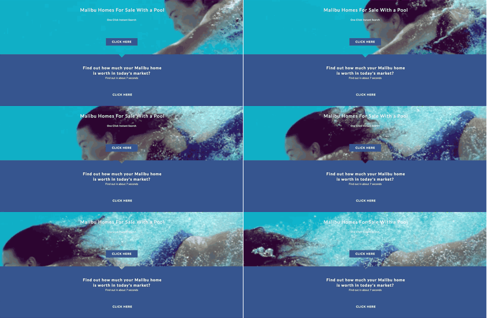
An example from real estate agent James Respondek's company optimized a beautiful landing page segmented for high-end buyers in the market for homes in Malibu with swimming pools.
Segment by how they got to your landing page
Because you have numerous ways to direct people to your site—social media, pay-per-click (PPC) on Google, email promotions, etc.—if you direct each channel to its own landing page, you know one more fact about that traffic that you can use to enrich your landing page.
Start by creating one landing page specifically tailored to one traffic source. Then, tweak that landing page so that it's custom-tailored to each traffic stream you plan on sending its way. In other words, adapt it.
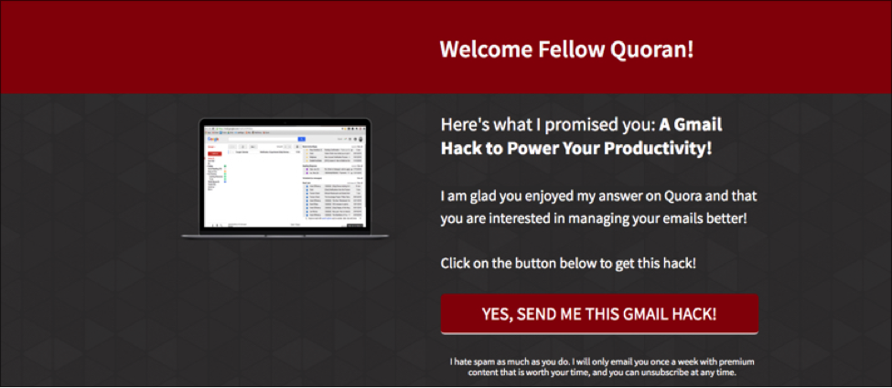
For example, you can optimize the landing page from your email promotion to include a line thanking them for responding to your email. Take the example below from Gianni Cara, who optimized this landing page for visitors who arrived from Quora.
Here's another example. Let's say you want to create a landing page that offers a free report to your blog readers, Facebook fans, Twitter followers, readers of a blog you're guest posting on, and AdWords traffic for particular keyword searches.
Instead of sending all of those traffic sources to the same landing page, it would be way more effective to create a different landing page for each traffic source. For example:
- If you know that your Facebook fans are, on average, significantly older than your Twitter followers, you may want to customize your landing page copy so it appeals to this specific age group.
- For your guest post: You might link to a version of this landing page that greets your new blog readers in the headline. This would help ease the transition between your guest blog post and the landing page.
- Or, let's say your Twitter followers tend to respond very well to videos. You might create a version of this landing page that features a video just to promote on Twitter.
Segment your landing pages to guide your leads on the best journey
Back that concept of the customer journey. You used segmentation to get the right people to your landing page and, armed with that knowledge, optimized the landing page to appeal to that traffic.
But that's not the last stop.
You can continue to segment that traffic from your landing page.
You can provide a simple call to action that offers your visitors the ability to click on the experience that most fits their needs. Often referred to as "visitor segmentation," this allows you not only to gain important insight into the leads you gather, but it also provides a richer, more personalized experience for your new lead, helping them feel welcomed into your brand.
Think of it like a "choose your own adventure" moment. Even though you did your best to segment your audience before they got to your page, you might not know precisely what drew them to your landing page. You can use the landing page to offer them a choice that will help identify exactly what they're looking for. This can help you provide the best service possible.
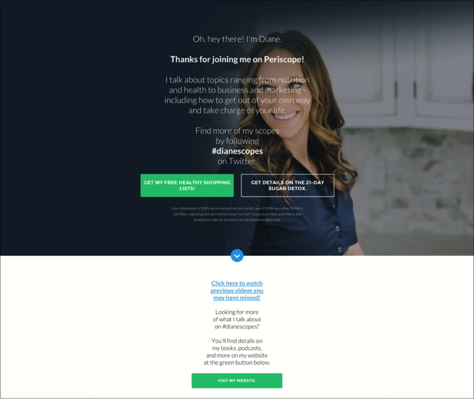
You may know something about how your leads are coming in, but visitor segmentation will help you learn even more.
- Are they a decision maker?
- Are they looking for a product demo or are they looking to speak to a specialist?
- Do they represent a company of more or fewer than 100 employees?
Now you can tailor their experience based both on their needs and your ability to provide a solution by giving them an opportunity to move through the experience that suits them best.
Take our A/C maintenance company again. This time, imagine they've targeted their inbound traffic to business owners as best they can, but they can provide value based on the square footage of the space that needs to be cooled. They could segment their visitors further by asking them to indicate whether their building is more or less than a million square feet. The visitor will know that the landing page they arrive at provides them the results that suits them best.
On this landing page for SCI Solutions, visitors get segmented by their role in the healthcare industry. In fact, their headline, "Who Says You Can't Please Everyone?", emphasizes that they want to create the most accurate experience possible for their clients.
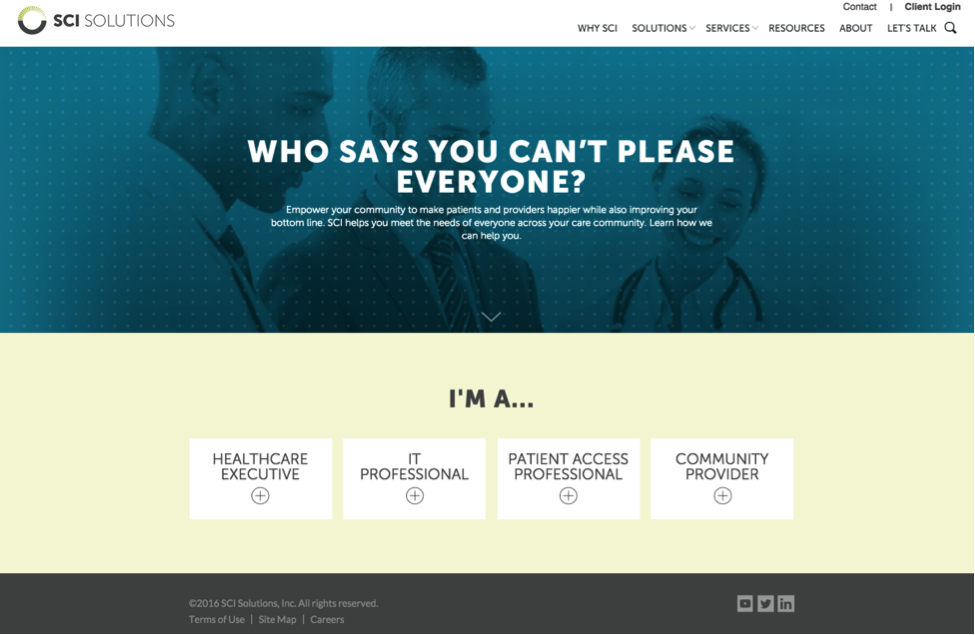
With visitor segmentation, you can add an additional level of segmentation and personalization that would be (nearly) impossible to achieve for the inbound traffic. Visitors want to know that the brands they explore can provide solutions that will work for them specifically. By segmenting your landing pages, you provide them that experience.
Segmentation for testing: the coup de gras
When you use (and track) marketing segmentation for landing pages, you will immediately gain insight into your whole sales and marketing effort.
The best way to use segmentation to improve your approach is with A/B testing, or "split testing." You can A/B test any aspect of your landing page that you think would help improve conversion.
Test copy: you can test any aspect of the copy: word count, phrasing, you can even get down to the difference in a single word if you like.
Test Images, color, and design: How does the design help move your visitor to the CTA? Does the CTA need a different colored background or submit button?
A/B testing is based on a somewhat scientific principle of controlled experimentation, but in practice, A/B testing is more of an art form. It takes a nuanced approach, and you can play around with variations to arrive to statistically significant conclusions.
Here's where testing gets fun! Visitor segmentation affords you an opportunity to test the kind of experience that your visitors are looking for. You can literally ask visitors to tell you what they prefer, right on the landing page.
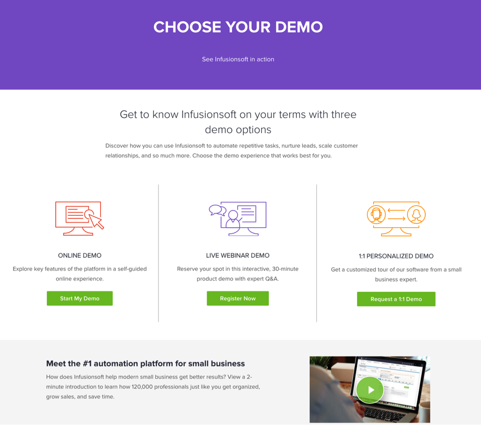
The Keap demo page is a great example of a segmented landing page that can also work to test user preference. The inbound traffic arrives on the landing page with the expectation of seeing a demo, but Keap offers three different ways to engage with the demo, allowing visitors to choose the kind of demo they'd prefer. If one kind of demo outshines the others, Keap can promote that best demo version in other ways, knowing that it has the greatest appeal.
Out-of-the-box considerations for creating landing pages that convert
Last, but not least, here are a few more tactics for squeezing the most value out of your landing pages—and creating landing pages that convert.
Be a problem solver
Your prospects aren't thinking in general terms about their business challenges. Nope. They have very specific problems they're trying to solve. The more you can demonstrate that you know the pain they're going through—and that you have the answer they're looking for—the more cha-ching you'll hear.
What does this mean in practice? It means leading with a value proposition, not a product.
Take for instance Instapaper's beautifully minimalist above the fold messaging: "Save Anything. Read Anywhere."
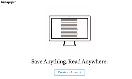
It's simple, direct, and tells you how the product solves a very specific problem: managing your information overload. Only after framing the value proposition does Instapaper get into what the product does, and its feature set.
Get personal
The statistics are in: Companies that personalize content win the conversion game. As Adobe reports, "Leaders in this digital transformation [of personalization] are reaping unparalleled benefits, winding up 26 percent more profitable overall, with a 12 percent greater market capitalization."
Utilize Google's keyword research tool to see what people are searching for as it relates to your product or service, as well as the wealth of information in your existing website analytics to create a suite of personalized opt-in landing pages. Additionally, you can drill down to things like location-based content to account for regional quirks, as well as referral sources like email, social media, and keyword searches. If you can dream it, you can (probably) build it.
Make it mobile
Remember our first tip, "Be a problem solver?" Guess what? Your customers are looking for answers on their phones.
You probably don't need to see another stat communicating the importance of mobile-responsive design, but in case you do, consider this:
Mobile devices accounted for 55 percent of internet usage in January of 2014. And that percentage has only gone up since then.
That's not to mention that Google has indicated that "mobile-friendly" websites and pages will start getting extra benefits in search rankings.
As Think with Google writes, "People pursue big goals in small moments. 90 percent of smartphone users have used their phone to make progress toward a long-term goal or multi-step process while 'out and about.'"
This means that even with longer cycle purchases, mobile is increasingly becoming a vital part of the research and purchase phases.
It also means that if you're not building landing pages that are mobile-optimized for a variety of screen sizes and devices, you're losing out on valuable leads.
Mobile-responsive landing pages (like the one above) dynamically adjust based on the size of the window or screen that's displaying them, as you can see in this example featuring the Modern Webinar template.
It's your job to make your landing pages adapt to your visitors' experience, not the other way around.
Besides being a business necessity, take one quick case study by Ion Interactive as an example of the power of mobile-optimized opt-in landing pages: "Using a mobile-optimized version of their desktop landing page led to 153% increase in conversions for Deluxe."
Be generous (but not overbearing)
If someone has made it to a landing page, they're ready to be sold. So, how much information do they need?
There's a long debate between opposing camps on whether landing pages should be long or short. How much is too much? The answer is, "It depends."
In that famous Conversion Rate Experts case study about how they made over $1 million for Moz by nearly quadrupling the size of Moz's original landing page, they share, "…is not how long your page is but rather how engaging it is." The longer page, filled with engaging content led to a 52 percent increase in sales.
But as Unbounce shares, "Shorter landing pages work best when the lead already knows what they're looking for and your page presents the exact solution without fluff or filler. In an example from ContentVerve, a shorter landing page for a gym increased conversion rates by 11 percent with 95 percent statistical confidence."
Treat the guests on your landing pages like you would guests at a dinner party. Feed them well, but know them well enough to know when enough is enough.
Now you've got an effective landing page
With recent web trends showing a move towards building more landing pages, and with the power of landing pages to compel viewers to take specific actions, follow the best practices from this article to make sure you're creating landing pages that convert—and not sending visitors clicking away, never to return.
But don't forget to test, test, test! Measure your results, and test one small change at a time to find the perfect landing page formula for your business.

