Take a peek at your email inbox and ask yourself: How many emails do you scroll by or delete without a second thought? And how many stand out? How many strike you as impressive? Beautiful?
More than likely, the majority of emails you receive is less than impressive. Like everyone else, you have very little patience for email that wastes your time. And if you send marketing messages, you definitely don’t want your emails to fall into that category. You want them to shine. The solution begins with your design.
Email is an effective channel for small businesses to generate revenue, nurture leads, and keep customers in the know. Keap can help you take your email to the next level.
Why should you care about the design of your emails?
There’s stiff competition for the inbox, and you’ve got to stand out if you’re going to catch your recipient’s eye. By far the biggest competition in the inbox is spam. According to Semantec, “Spam represents as much as 75 percent of all email sent across the internet.” More than anything, you don’t want your email to be perceived as spam.
While that sounds a little bleak, the really good news is that when you get your design right, your recipients will actually look forward to getting your email and they’ll seek your email out in their inbox.
So, keep all that in mind as we look at what it takes to building better-looking emails that get noticed. The points below will help you with your next email design:
1. What type of email are you trying to create?
First and foremost, the design of your email will need to support the purpose of the email you’re sending. There are three basic kinds of emails, and each kind sets out to accomplish unique goals:
- Marketing emails: This is a broad category also known as bulk email; these emails are sent by a business entity to a subscriber list. These emails include newsletters, flash sale announcements, promotions, and product announcements, etc.
- Transactional emails: These pragmatic emails confirm specific interactions with a brand, and the recipient expects to receive them. These include receipts of purchase, notice of shipment, welcome emails, password resets, account alerts, etc.
- Personal emails: These are emails between known individuals or specific groups. These can be personal in the sense that the sender and recipient know each other personally, but these also include business and work-related email. Some sales messages can fall into this category. When a sales conversation is underway, the
Email type matters. More often than not, your recipients can tell what type of email you’ve sent even before they open it, thanks to the subject line. And as they browse their email, they’ll get a preview of the body, which is when your design really comes into play. If the design doesn’t sync with the type of email, it can make a sour note.
For example, personal emails are generally plain text with few, if any, images. If your sales person wants to reach out to a prospect with a follow-up email to a sales call, plain text with a light branding, say your logo on the signature line, will reinforce that this is a personalized email. If it’s too “beautified” with images and unnecessary links, the prospect could assume that it’s a marketing message and may not read through.
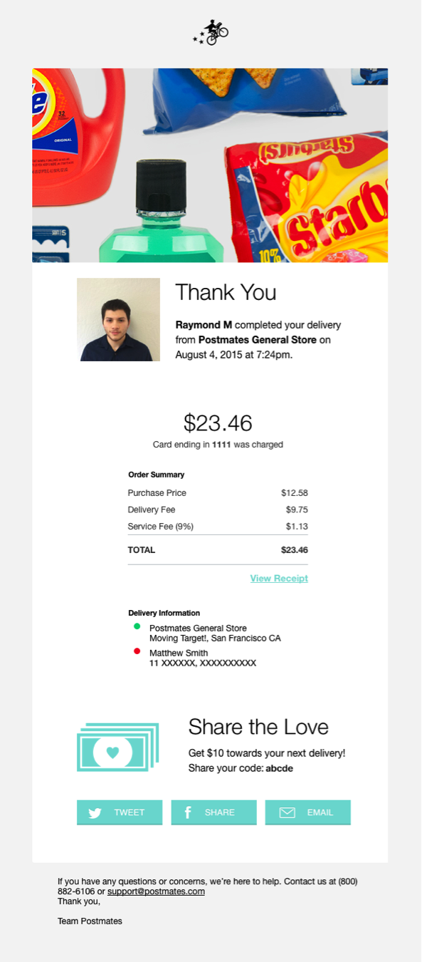
As a side note, don’t disregard the potential of your transactional emails: the open rate on these types is astronomical (over 90 percent), which means you’ve got the recipient’s full attention. Recipients are anticipating the email, and they want to ensure that all’s well with their transaction, so they open and read. Just because you’re sending a simple receipt for a purchase doesn’t mean it has to be boring. It’s an opportunity for you to put your brand’s personality on the page and (gently) provide an opportunity to continue engaging. But don’t forget the rules of the road: Transactional emails absolutely must deliver the message the recipient expects right off the bat. Check out this great example from Postmates:
2. Be clear on your calls-to-action (CTAs)
Your call to action (i.e. what you want the person to do as a result of your email) should be inherently part of your design. The look and feel of the email can be utterly gorgeous, but if the recipient doesn’t know what to do, then the whole email was wasted. Don’t waste your precious time and resources by burying the CTA in a cool design.
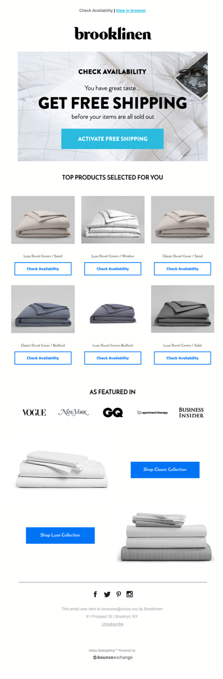
A great call-to-action can serve to enhance and beautify your design. Buttons and text links that integrate with the email layout actually increase click-thrus. You can have multiple CTAs in your email, but the best designs put the primary CTA front and center at the top, so that it’s seen in the preview, encouraging a full open and then click through, like Brooklinen does in their free shipping offer email.
3. Focus your message
Make the email as to-the-point as possible. That can’t be overstated.
Emails take up people’s time. Be respectful of your recipients’ time and get right to the point. Long rambling text, or enormous emails that are filled with information won’t get read, and will probably even lead to unsubscribes. If you have a lot to say, offer a short summary and then link to the longer content that users can read in full if they have the time. Just make sure your summary makes the point so they get the idea if they choose not to click through.
Even newsletters must stick to the point: provide a brief introductory message, and then offer links to longer content. Not only does this look tidy, but it gives your recipients more control in how they engage with your brand.
4. Your font choice matters
Fonts serve two purposes: to make the message readable and to add an artistic depth to your design. Your font choice must always hold up both ends of that bargain. If it leans too hard in one direction, it has to sacrifice the other, to the detriment of your design.
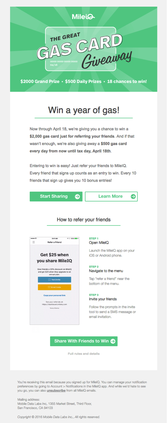
MileIQ uses a mix of fonts in the headline of their email to add a fun, attention-getting element to their headline. They chose to limit the flair to the headline (a smart choice) and use a basic sans-serif font in the body of the email, making for an easy read.
A side note on plain text emails: Plain text email can be very effective, harkening to a more personal email. For that, a basic sans-serif email font is best; it’s crisp, clean, and familiar.
5. Take advantage of space
The overall layout of your email should make the reading experience simple and enjoyable. The best layouts add to the appeal of your email and give it a professional look. Keep in mind the following elements of layout design:
- Headlines: Headlines help break up chunks of information into easily digestible portions, which makes them easier for your reader to scan through to the stuff she wants to read.
- Text blocks: keep them short. Again, summarize and link to longer content if necessary.
- Whitespace: Unused real estate is your friend. If your design is too congested, it will give your email a claustrophobic feel. Whitespace gives your reader breathing room.
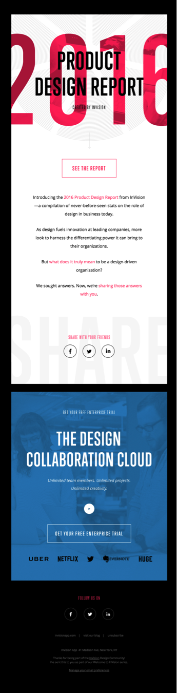
InVision’s email announcing their product design report optimizes headlines, font, and whitespace, making it a quick, easy read, while delivering all the details you need to know to act on the CTA.
6. Choose pleasing and pragmatic colors and images
The visual aspect of your email is where your business’ personality really shines. As such, color and images play the strongest role in setting the tone for your email.
Keep your brand colors in mind in your design, but don’t restrict yourself too much. There’s no fixed rule on precisely how many colors a brand should have, but most often brands pick two main colors and then build out a palette of complimentary colors. This helps ensure that design elements stay on brand while also allowing the freedom and flexibility to be creative.
The images you select shouldn’t clash with your brand colors. If you create your own images or photos, keep your brand color scheme in mind as you create. You don’t want to go through the work and expense of a photo session only to find that the images clash. When selecting images, be sure that they have a similar tone as your brand colors. That way, an accent color in a font or a button will really pop out.
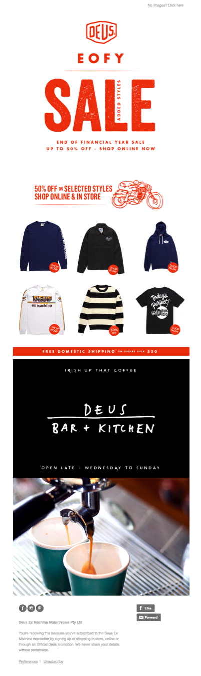
Check out Deus ex Machina Motorcycles used color and images in their email. Their main brand colors are orange and black, and the image of the espresso maker uses the dark black and a complimentary teal color to stay on brand. The effect is a harmonious blend of color across the entire email.
7. Don’t ignore mobile
Even though mobile devices are everywhere, people still continue to forget about the limitations of the small screen in their designs. While this problem is shrinking rather than growing, we couldn’t possibly publish a post on email design without mentioning this: 67.2 percent of consumers use a smartphone (like iPhone or Android) to check their email. So, if your email message isn’t mobile friendly, you risk alienating over two-thirds of your recipients. Let that sink in a little bit.
8. When in doubt, keep it simple
Of the best designs out there, most are actually quite simple. You don’t need to go crazy trying to make an award winning email design. Simplicity wins every time: a consistent color scheme, straightforward message, and clear CTA ultimately make the best impression and get the job done.
There are plenty of tools out there to help you build a beautiful email that will take the pain and suffering out of the process. Keap's email builder, for example, provides templates to get you started, or lets you drag-and-drop the design elements of your email from scratch.
Whether you use templates or you do it yourself, you’ll still need to balance the design elements discussed here. When you employ good elements of design, you’ll encourage an increase in the open rate of your email blasts. On top of that, with clear CTAs and design elements that support them, you’ll also improve your chances that a recipient will click through, which is, after all, the email endgame.
![]()