According to data from SaleCycle, it’s estimated that nearly three-quarters of online shopping carts worldwide are abandoned before purchase. By optimizing your checkout process, you can put more of those lost dollars back into your business. You’ll also build customer loyalty and encourage repeat shoppers with an easy, intuitive checkout.
In this article, we provide six crucial tips that will improve your checkout conversion rate:
1. Design a one-page checkout
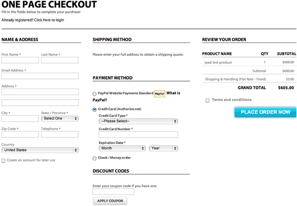
A one-page checkout process requires customers to complete the purchasing process on a single page. More and more retail websites are using this strategy as online shoppers expect their checkout experience to be a breeze. A one-page checkout process provides the following advantages:
- Looks shorter which encourages shoppers who are short on time to complete the purchase
- Eliminates drop-offs due to loading times from one page to the next
- Requires fewer clicks—research reveals that it’s ideal to require fewer than six clicks to complete a purchase
One-page checkout form sample
Source: IWD Agency
A lot of big e-commerce sites, like Amazon, Sephora, and Nordstrom, use one-page checkout to simplify things for their customers. Not only does single-page checkout reduce the number of clicks your customer needs to make to complete their purchase, but it also makes for a better shopping experience. On one page, customers can verify that they’ve correctly input shipping address, billing address, and other details. E-commerce solutions, like Shopify and Magento, offer responsive single-page checkout apps, so it’s easy to create even if you’re not very tech savvy.
Here are a few tips to help you streamline your one-page checkout:
- Place checkout elements like name and address at the right side of the page
- Include the option to use the billing address as the shipping address
- Provide an order summary at the right-hand side of the page
- Include payment methods
- Provide a clear call-to-action button, such as “Place Order”
2. Optimize checkout for mobile devices
Mobile commerce is projected to hit $700 billion by the end of 2017, growing more than 300 percent over the past four years. However, cart abandonment is higher on mobile, perhaps because people are on the go or more distracted by their surroundings. Eighty-four percent of mobile shoppers abandon their carts during the checkout process.
Here are actionable tips to optimize checkout for mobile:
- Make clickable buttons larger and more visible
- Reduce images to decrease loading time
- Display trust indicators such as “This is secure 256-bit SSL encrypted payment”
- Vertically align forms to facilitate navigation
- Remove distractions such as ads and popups and limit points of exit to encourage shoppers to complete the transaction
- Consider accepting easier mobile payment options like Apple Pay, where users can pay with their thumbprint
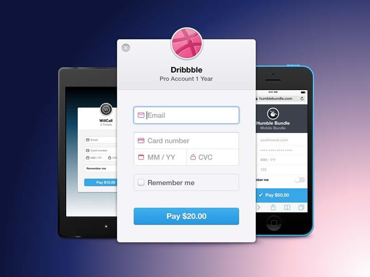
Easy to fill in mobile checkout forms boost conversions
Source: Dribble
With the massive year over year growth of mobile commerce, optimizing your mobile site’s checkout process is a sound investment.
3. Offer PayPal as a payment option
While credit cards are still the most common mode of payment, a lot of customers will only transact online using PayPal. In 2016, PayPal handled $6.1 billion of payment transactions from its 197 million active users. With PayPal, customers don’t have to enter their credit card information to make a purchase, making checkout convenient and secure.
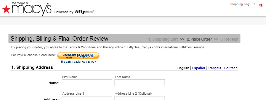
Multiple payment options increases conversion
Source: Optimonk.com
Major retail brands like Macy’s offer multiple payment methods, including PayPal. More importantly, they display the option to use PayPal at the beginning of the checkout process. This enables shoppers to review the payment options offered before they move forward with their purchase.
As an online retailer, you will need a point-of-sale system to help you process online payments. Most point-of-sale software integrates with PayPal and Square so your store can offer a wide variety of payment methods.
4. Require only the most necessary information
Including checkout form elements that have nothing to do with the transaction like “Company” discourage customers from completing the transaction. In the United States, checkout flows have an average of 23.88 elements, even though the ideal number to increase conversion rate is 12.
Review your checkout form. See if there are elements that you can eliminate, such as:
- Address Line 2
- Title
- Middle Name
- Middle Name/Initial
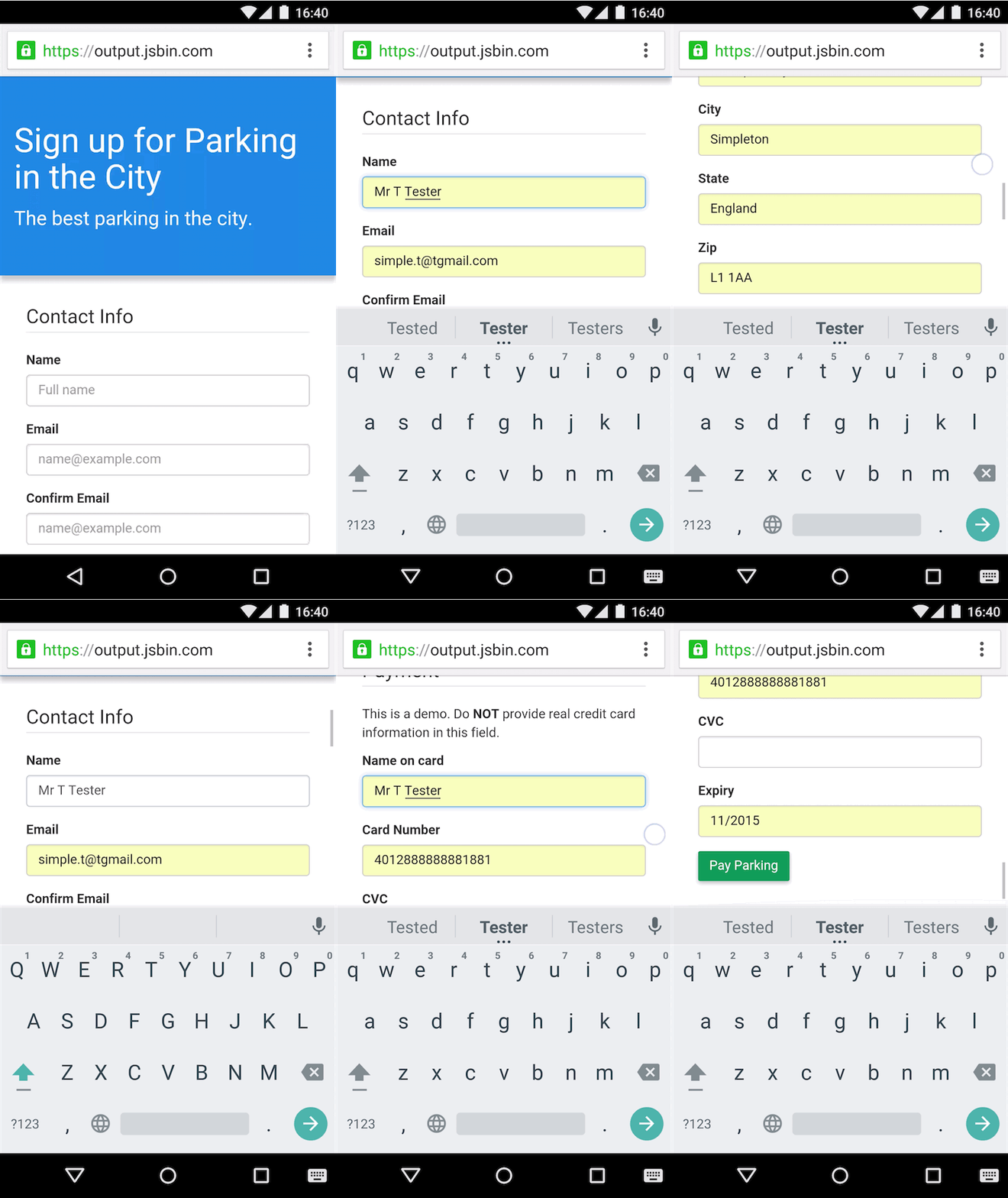
While you’re at it, consider using Google Autofill. A considerable number of your customers are using Chrome and Android to shop. Their personal details are most likely saved on Google, saving them the time from having to type their address anew. Using Google Autofill will help your website inch closer to the likes of Amazon, which enables one-click purchase from saved shipping and billing information.
Use Google’s Autofill to help customers quickly complete checkout
The autocomplete feature helps customers save time, particularly mobile shoppers. Tapping on mobile devices can cause errors and trigger frustration, which can lead to user drop-off. Google’s Autofill reduces these problems by autofilling form details that customers have previously entered.
5. Offer guest checkout
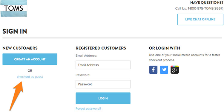
Requiring all users to register as a member, particularly for small e-commerce sites, is a big conversion barrier. Many shoppers don’t like the idea of creating an account on your website, especially if it is their first time buying from you. Nearly 1 in 4 users will abandon their cart if they are forced to create a new user account. Instead, offer customers the option to checkout as a guest.
Many large brands such as TOMS Shoes and Target offer guest checkout. Interesting, Amazon does not allow guest checkout because so much of their business is generated by Prime members and account holders.
Guest checkout is an option offered to new customers
Source: TOMS
As soon as customers click on the guest checkout option, take them immediately to your one-page checkout process. After they complete the transaction, give them the opportunity to save their details but resist the urge to force shoppers to register. Instead, provide an option that says “Would you like to save your details for next time?” This increases the likelihood that customers will save their details with you for a speedier checkout in case they decide to transact with you in the future.
6. Display security features during checkout
So far, our tips have focused on speed and ease of checking out. However, shoppers also abandon carts due to security reasons. They may opt to shop with your competitors if your checkout pages do not have trust indicators seen in most major retailers.
You should make it a point to display trust badges such as the Verisign or Norton Secured logo. These badges indicate that your online store is secure and reliable. Research shows that 6 out of 10 shoppers abandoned their carts because these trust logos were missing.
Trust logos displayed on online stores
Source: Instapage
Ideally, every step of your checkout process should feature these trust signals to reassure your customers that any information entered is protected. Among these trust logos, a Baymard study shows that the Norton Verisign badge gives 36.5 percent of customers polled the best sense of trust when paying online. Moreover, BlueFountain Media found a 42 percent increase in conversion rate after using the Verisign badge.
Display these trust badges to inspire confidence and a sense of security, which will encourage customers to complete the transaction.
Conclusion
Improving the checkout process of your online store should be high on your priority list because it has a direct impact on your bottom line. By optimizing the checkout process, offering multiple payment options, and displaying trust badges, you can reduce cart abandonment rates and increase conversion.
Krista Fabregas is a staff writer and e-commerce analyst for Fit Small Business, specializing in e-commerce. Krista spent 16 years building two specialty e-commerce sites up to more than $1.5 M in gross annual sales.

