In the marketing world, the call-to-action (or CTA) is invaluable. It constitutes the next step your visitor needs to take after seeing your ad or landing page. It shouldn’t be more than a few words, but choosing those words carefully could make all the difference in whether or not your visitor makes a conversion. A strong CTA is a powerful statement of intent that needs to be carefully constructed to have a compelling impact on your metrics.
Here are seven call-to-action ideas that will assist you when you write copy and design ads for your blogs, your landing pages, your email campaigns, wherever your CTA is bound to get optimum exposure:
1. Put your CTAs in the first person
Crafting your CTAs in the first person will create a more personal experience for your visitor. Using pronouns like “I,” “my” and “me” yield better results because people like to be addressed personally.
These phrases create a sense of ownership, as each visitor is having a unique experience just by visiting your page and receiving exactly what they came to get. The CTA “Download Resource Here” just doesn’t resonate as well as “Download My Free Resource Here.” You want to impart a sense of accomplishment with your CTAs, an objective if you will, generating an emotional connection with your brand. What is it that your visitors are hoping to get? Put yourself in their shoes–what wording would give them a sense of fulfillment and help them improve their day just by clicking on your CTA?
2. Use CTA buttons on banners where applicable
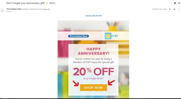
Whenever you’re reaching out to your audience with an objective in mind, make sure your CTAs stand out. Offset your CTA with a separate hyperlinked button within your email or ad, and use a different color scheme from the rest of the design so that all of the visitors’ focus is directed toward that part of the screen. The example below was from an email I received from The Container Store enticing me back during the anniversary of my becoming a member with them. Notice how the “Shop Now” button is placed prominently in the middle of the screen? (I was the one who added the arrows). When the CTA is that isolated, arrows aren’t necessary, it’s just the perfect sample of a strategically placed command.
3. Say more with fewer words
When it comes to CTAs, less is always more. Using language that’s clear and concise always gets better results. We’re living in an era in which instant gratification takes precedence so the fewest amount of characters you can use to compel your audience to make a conversion is key.
Consider the following examples I pulled from our frequent newsletter here at Keap. If you’re a subscriber, I’m sure you get these as well, and if you do, open up your copy of the newsletter and notice the strategically placed CTAs throughout the body of the mailing.
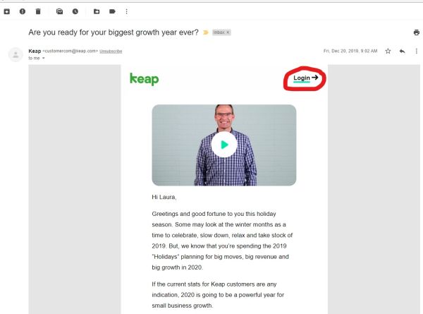
If you have an account with Keap, the newsletter gives you easy access to your login page so you can find out more about what our CEO Clate Mask is divulging in his video. Maybe it’s something you can follow along with as he’s speaking.
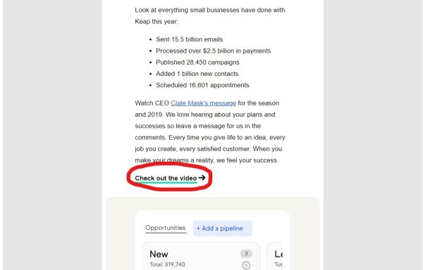
Scroll down a little farther and you’ll see another strategically placed CTA reiterating how to access the video aside from having it embedded at the top, giving your audience a couple of opportunities to watch the video and gaining more traffic and time on site to your company’s video page.
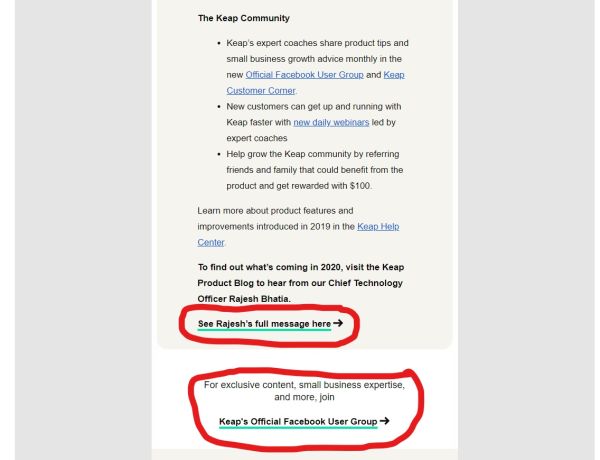
Finally, scroll down even farther and you’ll notice two more prominent CTAs. One prompts visitors to read our CTO’s message about what’s to come in 2020 and another asks our audience to join Keap’s Facebook Group.
What was one thing all of these CTAs had in common? They were all five words or fewer. If you know how to structure your CTA to say as much in as little as possible, you’ve mastered how to communicate with your audience and motivate them to make a conversion just by a simple command.
4. Take command of the situation
And speaking of commanding language, structuring a CTA that yields results has to articulate commanding communication. By this we mean use action verbs and phrases such as:
Try to avoid words and phrases like:
The best way to write an effective CTA is to get in your visitors’ heads and answer the question–what are they hoping to achieve by visiting your site? Are they looking for a quote? A discount? A consultation? Then draft the language according to desire:
Notice: five words each and they still leave room for the first-person possessor. Simple and effective.
5. Create a sense of urgency
Writing a CTA ad that’s time sensitive places a higher value on the end result. Whether that’s taking advantage of a sale, signing up for classes, or buying something that’s interest free, people tend to want something more when they know it’ll soon be unavailable.
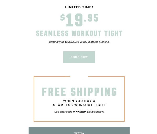
Take the example below from Victoria’s Secret, it’s offering a discount (notice it shows how much you can save) on workout tights for a limited time both online and in its store. The ad includes a simple “Shop Now” CTA button. Also, bonus! You get free shipping when you use its promo code. This ad got everything right–it created a sense of urgency, gave visitors a discount and rewarded them with free shipping by jumping on the limited time offer as fast as possible. They didn’t even give a deadline on the offer, as creating that much ambiguity is enough to entice shoppers to take advantage before it expires.
6. What benefits does the CTA offer?
In an attempt to increase your conversion rates, it’s always a good idea to focus on the benefits behind the CTA. Your audience knows you’re commanding them to do something, but why? How do they stand to benefit from your ad? What is it your company is going to do to enrich their lives? Check out the following Facebook ad from Asana. (Pay no attention to their CTA Sign Up button, that’s a bad example from above, the rest of the ad they got right. We don’t want you to think we’re contradicting ourselves.)
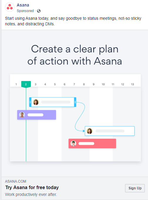
Creating a sense of urgency once again with “Starting today…” suggests a sense of euphoria; things will be different, better even, with Asana. Going forward, professionals can benefit from Asana by experiencing a workday without distractions including status meetings, sticky notes and direct messages that drive their attention away from what they’re doing. Asana promises the start of a new streamlined routine. It teases you just enough to get you to click, but doesn’t give away all the information up front. You always want to create a little mystery to give your audience motivation to learn more about how your company can benefit them.
7. Structuring your CTA
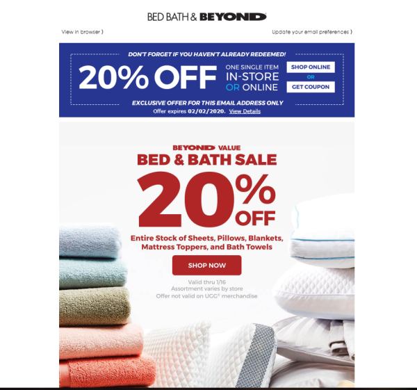
A lot of strategy goes into formatting your CTA. You’d be surprised how much the color, spacing, font and size factor into its effect. Obviously the bigger print is the more important information, but including the fine print also generates more curiosity, begging the question, what’s the catch? Here’s your opportunity to say, there isn’t one, just shop by this date and get a discount.
The following Bed, Bath and Beyond CTA is a great example and applies all of the principles from above. It’s timely, it’s eye-catching, as the entire CTA resembles a coupon, it uses command words, puts the important information in bigger font and has the entire ad hyperlinked so no matter where your audience clicks, a conversion is made.
For more information about how to take your small business to the next level, check out Keap’s renewed podcast, Small Biz Buzz, every week on wherever you listen to podcasts.