As human beings, we are by nature, visual creatures. That’s why social media platforms such as Instagram, Pinterest and Snapchat are so popular and successful–people like to be told a story through imagery.
On a platform such as Facebook, where visuals may be less prominent, as people tend to post text along with their images, it’s more important to post visual content that isn’t just visually pleasing, but captures the attention of your audience.
When it comes to creating engaging ads for social media, marketers and graphic designers take into account 10 characteristics that are effective enough to draw customers in and eventually inspire them to make a conversion.
These image characteristics include:
Below is a compilation of Facebook ads that comprise the best examples of social media image tips that you can leverage to build an eye-catching visual:
1. Color
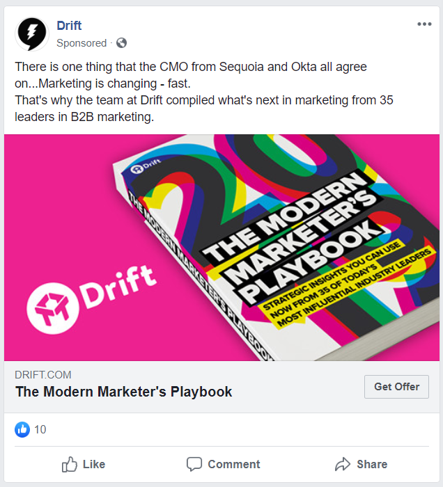
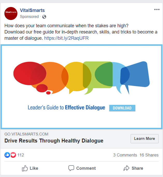
Color is obviously one of the more important and complex aspects of any social media design. A lot goes into color schemes, especially if it’s purposely meant to reflect a company logo. Color schemes not only help pull attention toward an ad, but they help set the tone, create an atmosphere, convey emotions, and in some cases, tell a story. In the two examples below from Drift and VitalSmarts, respectively, these ads each leverage color in very deliberate ways.
Drift’s ad is not only flamboyant, but the background color is meant to complement the color scheme of the product’s book cover, drawing customers’ eyes to the title that implies we’re working in a fast-paced business and this product will help you keep up with the times.
VitalSmarts’ ad not only uses various colors, but various shapes, as each one is a little different, acknowledging that everyone communicates in their unique way even though the guide that it’s promoting implies we can still work through our individual personalities and have a productive conversation.
2. Balance
In an image, different elements carry different forms of weight, paying homage to the four types of balance:
1. Symmetrical
2. Asymmetrical
3. Radial
4. Crystallographic
While creating an ad, consider the order in which to balance the weight of your product so it’s in line with what the ad is trying to convey. It doesn’t just have to be limited to alignment–consider aspects such as size, lightness and darkness, warm and cool colors, texture, quantity, isolation and orientation (vertical/horizontal/diagonal) of objects.
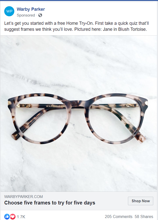
In the image below posted by Warby Parker, a pair of glasses is perfectly centered on a marble background that not only helps the glasses stand out with the created contrast, but the balanced appearance of the glasses implies the perfect vision the customer will experience upon purchase. Plus, it’s another way to exhibit one of its many unique styles.
3. Lines
Making the best use of lines in your ad helps direct your audience members on their visual journey. You can use straight lines to impart a sense of order and tidiness in the image while crooked or curved lines may give the image a sense of movement.
In the ad below posted by Tasty, it opted to employ straight lines in its collage that separates nine visuals of easy-to-make meals as an enticing preview to one of its videos. Giving the audience a teaser such as this is an effective way of piquing curiosity, giving people an incentive to click play and watch the whole thing in its entirety.

4. Typography
As much as you want your ads to stand out while employing fancy typography, it’s important to also consider readability. The whole point of the ad is communicating your product to your audience, so it doesn’t do any good if the font is illegible.
Choosing the perfect font or set of fonts that complements your imagery can really bring your social media ad to life. The font also has a lot to do with the message your brand intentionally (or unintentionally) is trying to convey.
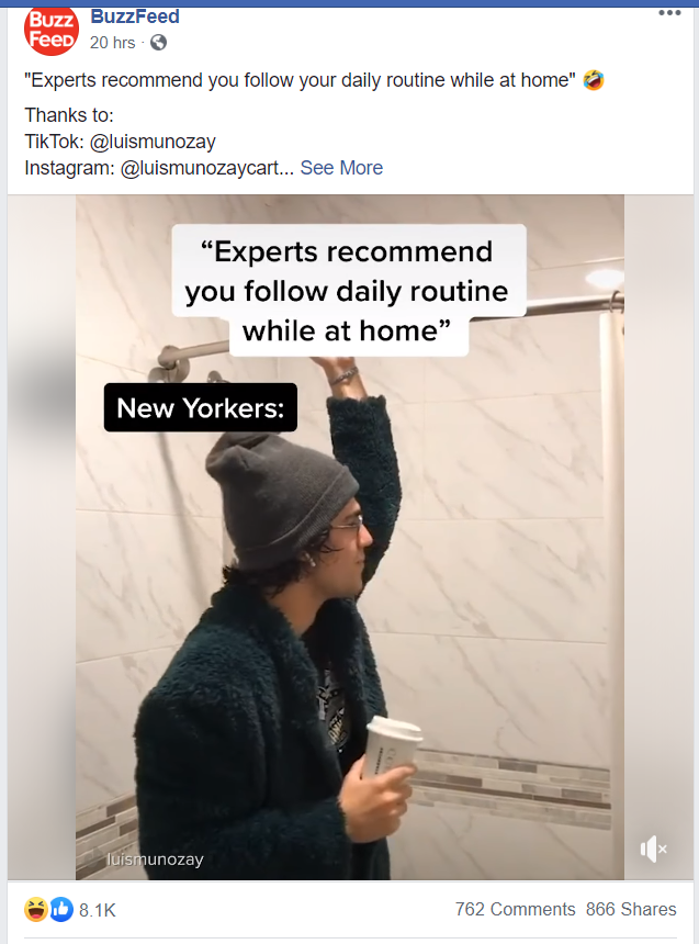
BuzzFeed always does a good job of posting relatable content. In the scenario below, it’s a screenshot of somebody’s Instagram story, using the caption from the app that employs one of the font selections available to users. It’s also another clever use of a preview image so visitors can expect to see more visuals along the lines of how people are trying to imitate their once daily routines while maintaining social isolation during the coronavirus pandemic.
Consider the following when using fonts:
5. Contrast
Using contrast in online ads provides differentiation between elements, making the overall image stand out or “pop.” It’s also important to follow the notion of less is more, as the design can also easily become too cluttered due to too much contrast–it’s all about balancing the image with the three following contrast features:
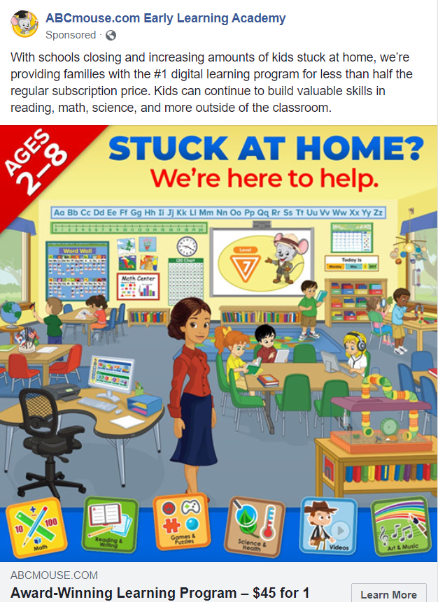
This ad posted by ABCmouse.com is the best example of contrasting colors, shapes and sizes, as it’s supposed to emulate an elementary school classroom, which usually includes those contrasts by default.
The company created a beautiful display that exudes a warm and safe environment for children to learn and play. This is an ad for parents who want to enroll their children in a reliable learning-from-home program, giving them the confidence that their children will receive just as sturdy of an education while social distancing at home as they can in an actual classroom.
6. Scale
There is so much you can do with scale. Scale allows designers to zoom in or out on an object, bringing certain elements into focus and allowing your audience to make sense of an ambiguous concept or object.
In the ad below posted by Avnet, the company decided to highlight one of their microcontrollers by intensely magnifying one of their boards, giving customers a better idea of just how they can program with the processor core, memory, input/output (I/O) peripherals, timer/counter, and communication ports contained within.

7. Proximity
Proximity involves grouping items together to create a sense of organization within the design. When grouping together similar or related elements, it creates a relationship and continuity between them, instilling an appearance of tidiness.
The easiest way to accomplish this is by physically placing objects near each other and connecting them in visual ways with the use of similar colors, fonts, size, etc.
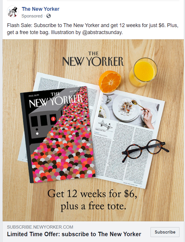
In the example below, “The New Yorker” posted an ad for one of its subscription flash sales. It exudes much sophistication and organization with two copies of its magazine, one closed with a very eye-catching cover, and one open, near a glass of orange juice and reading glasses, implying that its publication is conducive for morning reading, instilling a sense of accomplishment in the visitor should they decide to take advantage of this limited time offer.
8. Repetition
An easy way of capturing the attention of your audience and enhancing your social media images is by employing the concept of repetition, also known as “consistent branding.”
To be successfully repetitious without crossing the line into monotony is being consistent with fonts, colors and logos. Over time, steadily employing these three elements will give your brand a unique look and be easily recognizable by target audiences.
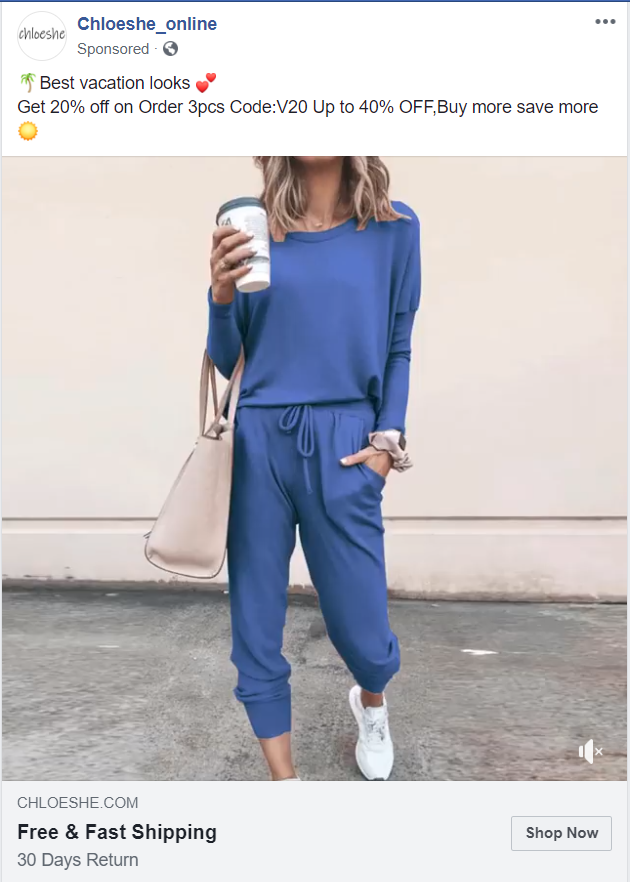
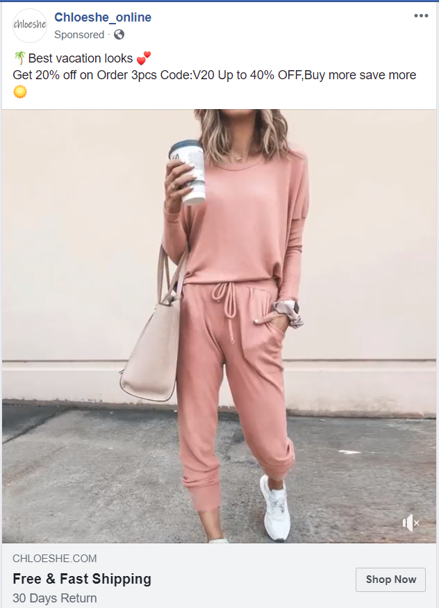
In the social media ad below posted by Chloeshe, the company decided to post an animated promotion of one of its decipherable outfits available in an array of colors. For the purposes of this article, we only captured two screenshots, but the same outfit was rotated in the ad in six different colors, showcasing one of its signature looks, but in many different scenarios.
9. Direction
The way objects are placed in ads are often accommodating to human eye movements. Certain designs in images, websites and other visual elements adhere to particular eye patterns that people have been demonstrating for years, staying in line with the eye movement’s deliberate “flow.”
Website design research reveals that people tend to read in “F,” “E” and “Z” patterns. Hence, ad designers will place important and eye-catching elements in the upper-left corner and left side of any layout, which is likely to gain the most traction.
Pantheon kept this in mind when it designed its ad for a website relaunching guide, placing the product at an angle to direct the already trained eye to its title in the top-left corner of the image. This strategy ensures that customers can read the entire title in a single glance, which would most likely be demonstrated in a heat map with most visual concentration gathered in that spot.

10. Space
When it comes to the usage of space, never underestimate the power of simplicity in your design–sometimes what you leave out of an image is just as important as what you add.
Space, whether it’s negative space (the space between objects) or white space, provides a certain aesthetic quality while still highlighting the most important elements.
Leveraging certain shapes, fonts and colors in and among negative and white space in your ad creates a strategic design that draws more attention to premier objects and messages.
Consider the example ad below for a free MasterClass. Notice how all of the important information is centrally located in the white space, which is not only easier to read, but is more aesthetically pleasing to the eye, emanating a clean and organized look.
The design is catering to the tone of the ad, which is subliminally suggesting that taking a MasterClass and making the most out of your quarantine during this coronavirus pandemic will help you feel happier and productive.

Go forth, designers!
It’s always fascinating to learn the tips and tricks that go into sponsored ad design, it almost makes you feel hoodwinked in a way. Nevertheless, for those of us who are on the marketing and creative side of the equation, we should pay much attention and use these ideas to our advantage as much as possible to ensure success and engagement with our brands.
Use Keap to take the next step toward powerful client communication.