When you want to run a special, limited time offer—a flash sale—your email contact list needs to know about it. So, naturally, you fire off an email announcement. Also called an “email blast,” these all-points bulletins for your list get the word out fast, and when they’re done right, will drive traffic to your sale. Check out how Keap can help.
While newsletter blasts are an indispensable part of your marketing strategy, they have one little drawback—they run the risk of appearing like spam.
It’s a tricky row to hoe. Email content that hits a user’s inbox but doesn’t seem to be a personal message always runs the risk of appearing like spam. You don’t want that.
Imagine there’s a list taped to your refrigerator called, “Top Misperceptions Of My Brand I Want To Avoid At All Costs.” The number one item on that list would be “They think we send spam.” This means that your biggest priority when you send your email blast is always to ensure it doesn’t feel spammy.
How do you do that? Like this:
- Make the email beautiful. A professional look, elegant font, evocative photos work together to help the email stand out, as well as feel legit.
- Segment your list to ensure that you send it to the set of people on your list who would most likely want it (Don’t send an announcement for your meat sale to the vegetarians on your list).
- Get right to the point. Flash sale emails shouldn’t beat around the bush. The call-to-action (CTA) should be front and center, ideally visible in preview. Your blast email should only have one objective, and shouldn’t have to rely on the recipient reading all the way through.
To help illustrate the point, following are some examples of really super deluxe great email blast samples, along with a breakdown of why they’re so good.
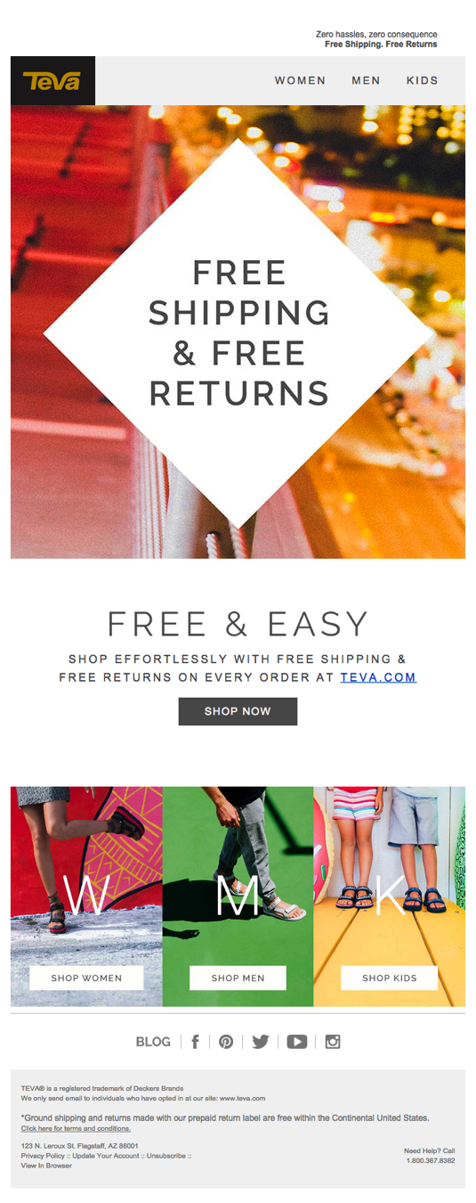
Teva: Free Shipping Offer
Teva’s email situates an attractive, clear CTA front and center, using the diamond pattern to further call it out on the page. Email recipients can click through without scrolling down to go right to the sale, but for those who do scroll through, they can follow the sub-CTAs to go directly to the product category that suits them (which is a level of added personalization that many users want).

Taylor Stitch: Halloween Sale
The CTA on this email is clear and elegant, and the promo code has a playful element in the spirit of the holiday. Taylor Stitch sells both men’s and women’s clothing, but they’ve segmented this email with sub-CTAs highlighting men’s shirts, so that those who’ve opted in to receive updates on men’s apparel are getting exactly what they wanted. A similar email went out to those who opted in to receiving updates on women’s apparel.

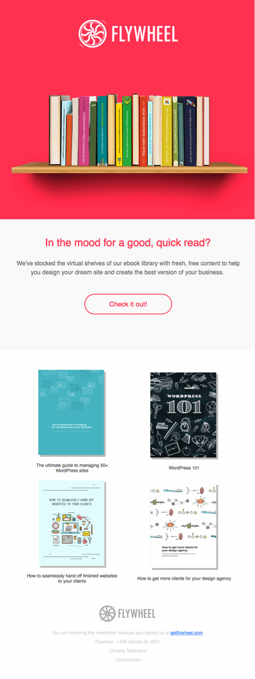
Flywheel: Free Content Offer
Flywheel supports the workflow of web designers, so the gorgeous above the fold image would appeal right away to anyone who loves design. While this isn’t a flash sale email, this email blast simply delivers a library of free resources to subscribers. Who wouldn’t want an email that asks nothing of them, but gives them free stuff?

J. Crew: End of Summer Sale
This email embodies every bit of summer, with its giant ice cream cone motif. The long image format encourages scrolling down, but the CTA inviting the scroll adds to the feeling of anticipation. Cleverly, the point of the cone points straight at the CTA button. This simple email works not only because of the great image, but because it has noticeably few words to bog down the point: Go to see what’s on sale.

EF College Break: Holiday Travel Sale
This email grabs your attention right away with it’s bold black text on white background, which perfectly matches the gritty message: “Tonight make a resolution you’ll want to keep.” This gets the user scrolling to see what’s up, and the compelling travel offers paired with epic photos inspires adventure.


