What constitutes a successful conversion rate? According to WordStream, “Across industries, the average landing page conversion rate was 2.35%, yet the top 25% are converting at 5.31% or higher. Ideally, you want to break into the top 10% — these are the landing pages with conversion rates of 11.45% or higher.”
Here’s a homework assignment for you: check the metrics of your ecommerce site to learn how your conversion rates are performing. If you’re in the top 25% but have ambitions to improve into the top 10%, there are some things you need to know.
Some of the standard landing page optimization tactics pertaining to small businesses trying to improve their conversion rates may not be effective.
In an effort to improve your conversion rates, you may decide to make small changes to your typography, brighten the color of your call-to-action (CTA) buttons, perform some A/B testing with your title tags, etc.
However, making these small changes will only yield small results. It’s time to think bigger. Check out these robust landing page optimization strategies that will help your small business website see improved lead generation and higher conversion rates:
Go straight to the source
If you’re seeing a conversion rate on your website averaging about 2%, there’s clearly a disconnect between what you’re offering and what your audience is seeking. So, why not ask them what they want?
Generate a survey or a data entry form that your visitors can populate upon entering your site, sometimes a free trial or a free demo doesn’t cut it, depending on your industry.
Going straight to the source and asking the audience members what would help them feel appreciated, valued, inspired and excited will reveal exactly what your visitors’ goal is by clicking to your website. Use this information to turn those goals into your main headline when they click on your homepage.
Don’t bury the lead — help your visitors by showing them you can provide a product or service that will help them feel empowered.
Less is more
Don’t overwhelm your audience with an overly complicated landing page — just keep it simple. Employ a monochromatic background with very few items above the fold. These can include:
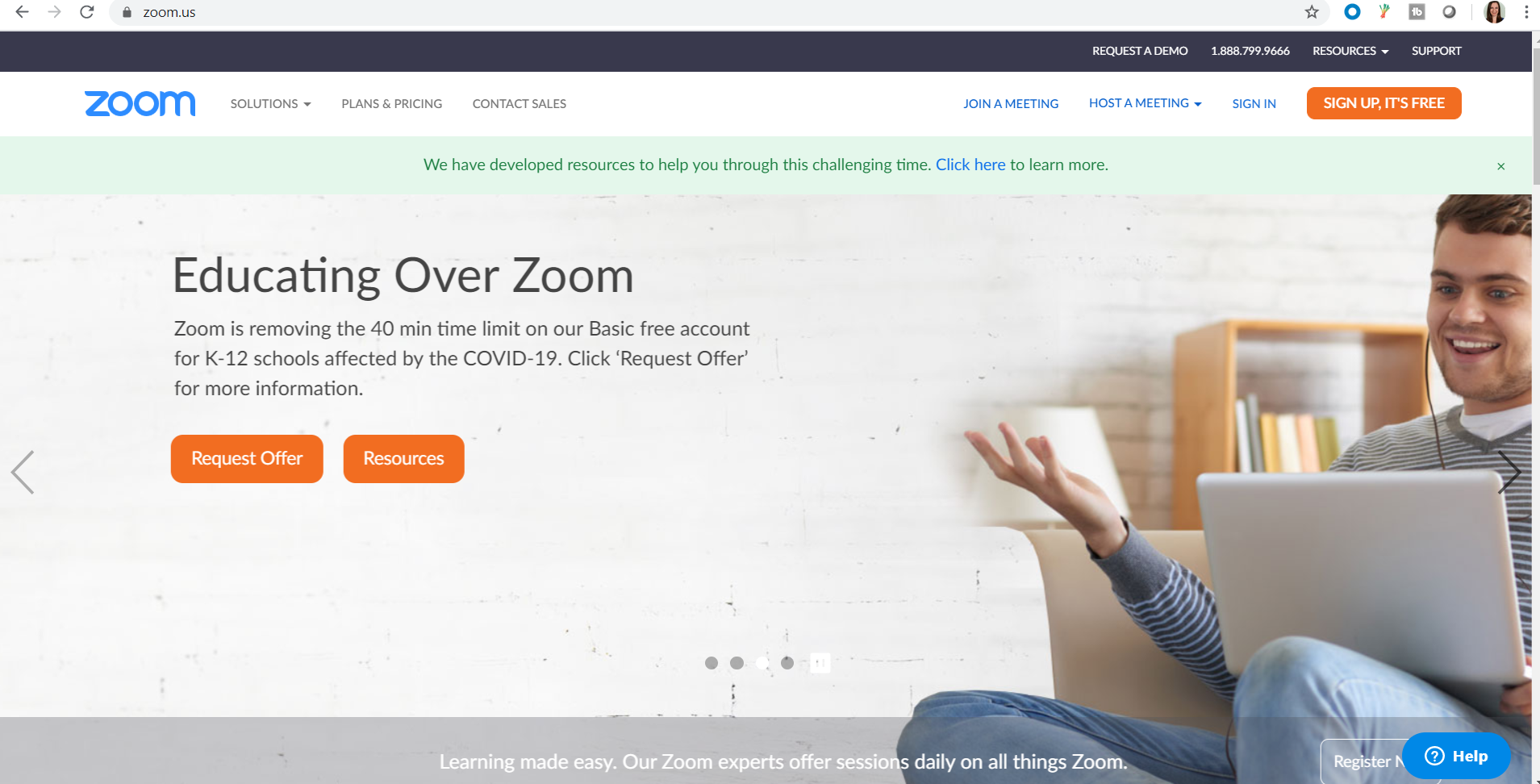
Check out the following example demonstrated by Zoom:
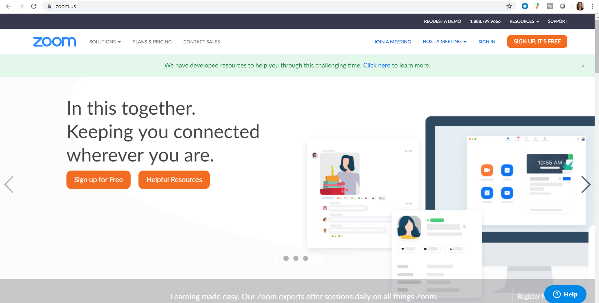
I, for one, appreciate the simplicity of its landing page. It has all of the elements required including its company name in the top-left corner, which according to heat maps is where our eyes look first, so that was strategic placing at its finest.
Its mission statement is also clearly pronounced in legible typography, which has obviously been refreshed and updated, as it’s subtly acknowledging how helpful its service is in the midst of the COVID-19 pandemic, helping people stay connected and productive while social distancing. It also added a CTA just below the navigation bar in a contrasting color, calling attention to how its resources will help its visitors during this “challenging time.”
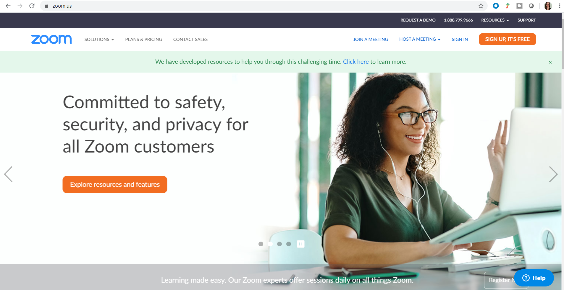
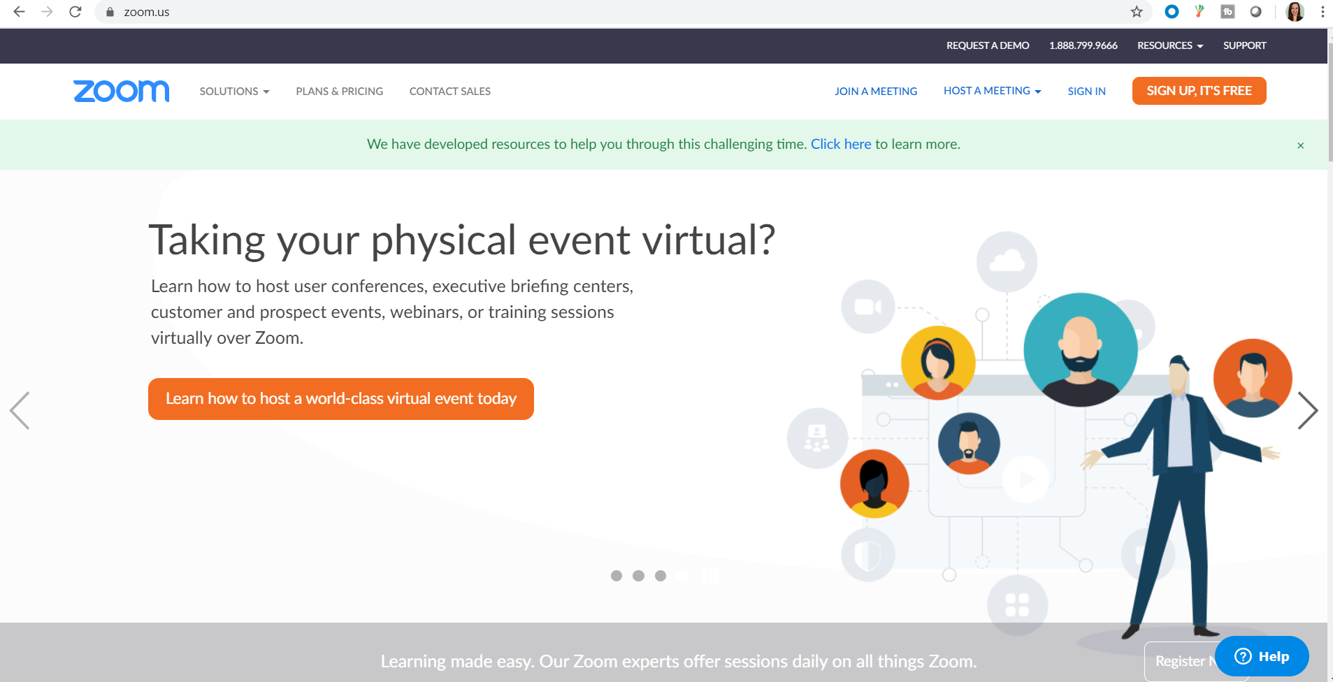
Next, notice how the company strongly leverages its other CTA buttons and deliberately places them in various locations on the page:
Some of the CTAs are displayed in contrasting colored fonts while others are offset by a different colored button. Ensure your CTAs don’t confuse your visitors–make them clear, concise and intentional.
Zoom also includes a rotating carousel of images showing users enjoying its product, representing its brand, its functionality and its values. It’s also a clever way of revealing its extended list of features and services without cluttering up the homepage with too much text and imagery. Plus, each rotating page is another opportunity for your audience to make a conversion.
Optimize your credibility
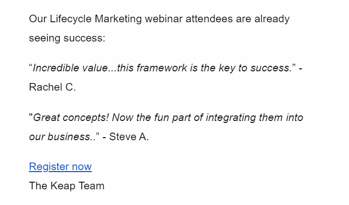
Small businesses that include testimonials or reviews on their landing pages add quite a lot of value to their content, especially if people who are contemplating making a purchase are on the fence about doing so. Consumers are more apt to commit to buying a product after reading other customer reviews and seeing what their experience was like.
Include pulled quotes from some of your shoppers’ testimonials as well as video messages if you can convince them to go the extra mile to talk about how satisfied they are with your product. You want to communicate to your audience that you are there to help them achieve great results.
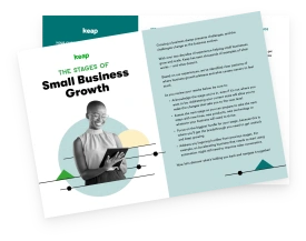
The example below is from Keap’s webinar promotion email campaign, including quotes from happy attendees followed by a CTA that links to the registration page. Customers appreciate the path of least resistance, so make any conversion you want them to complete as easy and straightforward as possible.
An exit strategy
Circling back to the concept of employing interstitials, these don’t have to be limited to when visitors enter your website. Exit pop-ups are also very robust conversion tools, as they’re basically the Hail Mary pass in a last-resort attempt at getting your customers’ attention.
Exit interstitials are less intrusive than ones that pop up as soon as a visitor arrives on the page, disrupting them from exploring your content and potentially discouraging them from completing a conversion.
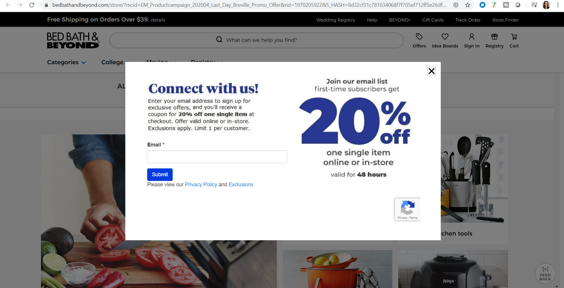
Your exit pop-ups should leverage a combination of a strong headline, a CTA using strong verbs that incentivize customers with a special discount, free shipping, etc., as well as eye-catching visual imagery.
Consider the example below demonstrated by Bed, Bath & Beyond: Its exit pop-up consists of one data entry form, (it’s very important to limit your initial submission forms to three items or fewer in an effort to not overwhelm your shoppers) as well as a 20% coupon as a reward for making the conversion to sign up for its email list. Notice: it made the 20% discount available for only 48 hours to create a sense of urgency.
Its stipulations are very transparent and visitors can’t miss its eye-catching incentive on the right.
Landing on your feet
If you’re finding your landing pages aren’t quite up to par as far as conversions go, never fear. Troubleshooting the aforementioned landing page optimization tools is bound to help your website conversions improve and your sales soar.
Remember to take it one day at a time, and if you see something doesn’t show results, try another strategy. Your website should always be a work in progress — if you’re constantly enhancing your brand and catering to your customers in different ways, your loyal followers will take notice and truly appreciate the effort.